As we continue creating our Joomla 3.0 template from scratch, we will now make the template responsive.
Much of this tutorial is going to be simply showing you the changes that we’re making to the template, but we’ll add a few descriptions of what we’re doing and why when necessary. We recommend that you read the official bootstrap documentation here on how to make a template responsive using bootstrap.
Our template as it looks now
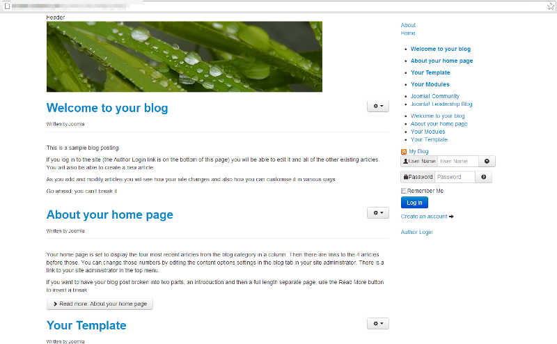
You can see in the screenshot to the right how our Joomla 3.0 template looks at this time.
Removing any css that controls page structure
As Bootstrap and its responsive features basically control the structure of the page, we can remove any previous CSS that we’ve added that deals with the layout of the page (vs. styling the page, as in colors , font sizes, etc.)
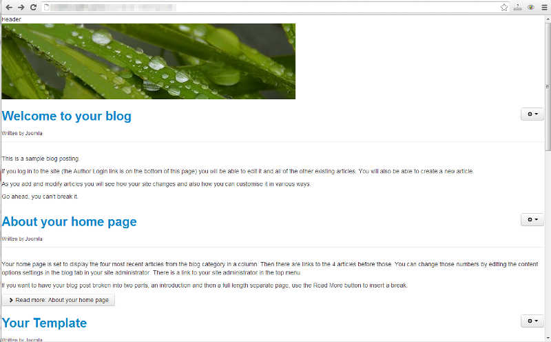
All of the code in our css/style.css file controls the template’s layout, so we are going to delete all of the code in that file. The screenshot to the right shows our template after all the code has been deleted from our css/style.css file.
Adding bootstrap-responsive.css and the viewport meta tag
As per the official documentation, we need to add the following two lines of code to our template to turn on the responsive features:
<meta name="viewport" content="width=device-width, initial-scale=1.0">
<link href="/support/assets/css/bootstrap-responsive.css" rel="stylesheet">
The following lines, highlighted in green below, show how we incorporated this code in our template’s index.php file.
<?php
$doc = JFactory::getDocument();
$doc->addStyleSheet($this->baseurl . '/media/jui/css/bootstrap.min.css');
$doc->addStyleSheet($this->baseurl . '/media/jui/css/bootstrap-responsive.css');
$doc->addStyleSheet('templates/' . $this->template . '/css/style.css');
$doc->addScript('/templates/' . $this->template . '/js/main.js', 'text/javascript');
?>
<!DOCTYPE html>
<html>
<head>
    <jdoc:include type="head" />
    <meta name="viewport" content="width=device-width, initial-scale=1.0">
</head>
We won’t show you a screenshot of these changes, as at this point they have made no impact to how the template looks.
Adding the container class
The bootstrap documentation says to set the main div that holds all of your content to a class of container. In our starting template, the main div has a class of main_container, as seen in the code below:
<body>
    <!-- main container -->
    <div class='main_container'>
After making the necessary change, changing the class from main_container to container, our code looks like this:
<body>
    <!-- main container -->
    <div class='container'>
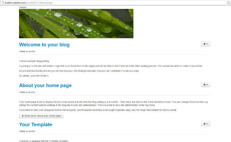
As you can see in the screenshot to the right, our template is now taking a little more form to it.
Adding row and span* classes
Again, you’ll want to read the official documentation to learn more about adding row and span classes to your template. In essense, the row class defines a container that will hold span* classes. A row is divided into 12 columns. If you wanted one column to be 3/4 of the page, and another to be 1/4 of the page, those fractions would equate to 9 and 3. The bellow is a basic example of how you could setup the 3/4 and 1/4 layout:
<div class="row">
  <div class="span9">Larger content area</div>
  <div class="span3">Smaller sidebar area</div>
</div>
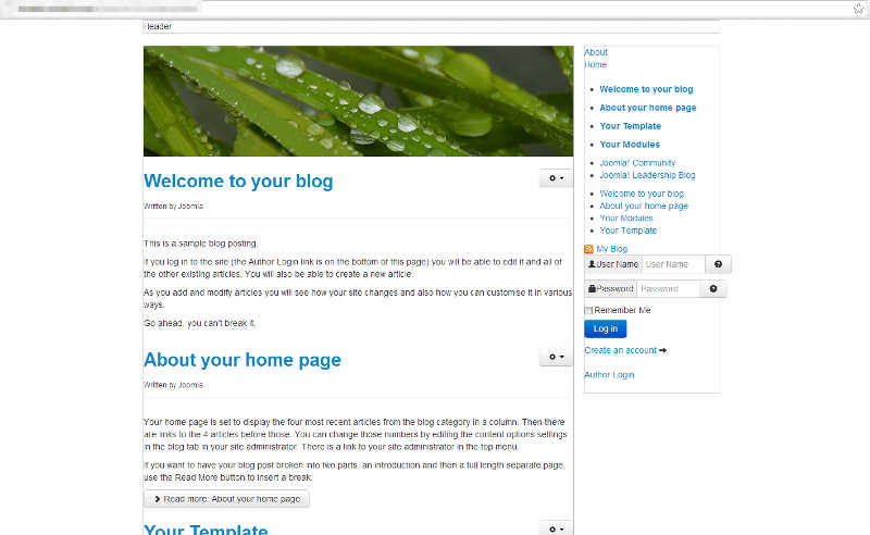
In the screenshot to the right, you’ll see our template after being setup with the row and span classes. Below, you’ll find the code that makes up our index.php file after making all the changes discussed on this page.
Our template’s index.php file up to this point
<?php
$doc = JFactory::getDocument();
$doc->addStyleSheet($this->baseurl . '/media/jui/css/bootstrap.min.css');
$doc->addStyleSheet($this->baseurl . '/media/jui/css/bootstrap-responsive.css');
$doc->addStyleSheet('templates/' . $this->template . '/css/style.css');
$doc->addScript('/templates/' . $this->template . '/js/main.js', 'text/javascript');
?>
<!DOCTYPE html>
<html>
<head>
    <jdoc:include type="head" />
    <meta name="viewport" content="width=device-width, initial-scale=1.0">
</head>
<body>
    <!-- main container -->
    <div class='container'>
        <!-- header -->
        <div class='row'>
                <div class='span12'>Header</div>
        </div>
        <!-- mid container - includes main content area and right sidebar -->
        <div class='row'>
            <!-- main content area -->
            <div class='span9'>
                <jdoc:include type="modules" name="position-3" style="xhtml" />
                <jdoc:include type="message" />
                <jdoc:include type="component" />
                <jdoc:include type="modules" name="position-2" style="none" />
            </div>
            <!-- right sidebar -->
            <div class='span3'>
                <jdoc:include type="modules" name="position-7" style="well" />
            </div>
        </div>
        <!-- footer -->
        <div class='row'>
                <div class='span12'>Footer</div>
        </div>
    </div>
</body>
</html>


