It’s no secret that your website is a great tool to generate more leads and profit for your business. However, bad web design and a cluttered layout can hurt your digital marketing efforts. In addition, omitting elements like a call to action (CTA) or a contact form can stunt your online growth and revenue.
Why create a website if you’re not going to optimize it for business growth?
This article will guide you through essential website elements that increase online profits for small businesses. No matter if you’re new to the digital space or would like to revamp your current website, this article will list elements that you should consider when optimizing your website for online growth.
Launch your web presence quickly and easily with our Shared Hosting plans!
Intuitive Website Design — Master Your Homepage Layout
When someone lands on your website, will they be able to easily understand your business and how to get in touch with you, or are your services and contact information confusing and unclear? How easy is it for your audience to navigate and interact with your website?
Before we discuss which elements to add to your website to boost your online business, we must first cover best practices for basic website elements. Adding basic website elements is a simple task when creating a website, however, you still need to make sure you’re implementing them strategically to increase your leads and profit.
Here are some guidelines to consider when creating your homepage and website:
Value Proposition
What sets your business apart from your competition? What pain points do you answer for your target audience? Though you do not need a literal section for listing your value proposition, the message should be clear for your audience as soon as they land your homepage. How can you help them?
Call To Action
Once you’ve properly added your value proposition to your website, you will then need to add a clear next step for your audience to follow. This is also known as a call to action (CTA). A CTA informs the audience of the action you want them to take on your website once they land on it. For example, your CTA could encourage them to subscribe to your newsletter or sign up for a free trial. However, overall, make sure you define some type of CTA on your website. Directing their actions will help you increase the number of leads you gain from your incoming traffic. There is more information about CTA types and best practices below.
Social Media Links
This should come at no surprise. If you have social media accounts for your business, link them to your website. Social media can enhance your online presence and gives your audience another opportunity to engage with your business. It also increases your digital reach and allows your business to be shared easily across platforms. It’s much easier to tag a friend in a social media post than it is to email or text a website URL.
Intuitive Navigation
Planning your website navigation should be done strategically, especially if you plan on adding to your website in the future. Top-level navigation and dropdown items should be clear. If you don’t want to name the page “about,” consider common alternatives like “who we are” or “what we do”. However, try to stay away from words and phrases that are too unique. You should not have to explain the name of the page, the name should be a clear description of what the page will contain.
Highlight Services, Products, and Content
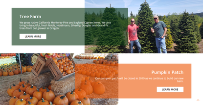
As your website visitors scroll down your homepage, they should see sections highlighting your services, products or content. It should not be a lot of text, possibly just an image, 1-2 sentences and a button linking them to the respective page to learn more information. However, there should be brief information on your homepage showcasing what can be found on your website. Think of it as a summary or an overview. Also, the sections can and should be updated periodically. If you’re selling products, showcase different products, different categories, or popular products. If you have a blog, add a blog feed that will display your most recent blog post on the homepage as you publish them.
Clear Contact Information
Once they’ve read through your homepage, contacting your business should be easy. The contact information you’re providing should be listed in your header, footer, or both. In addition, consider adding a contact form to your footer as it will then be seen throughout your entire site. You can also create a contact page to house the contact form. We talk more about contact forms below. If you create a contact page, even if you have your contact information in the header or footer, make sure you still add your contact information to the contact page. Give your website visitors every possible opportunity to see and use your contact information.
Testimonials & Awards
Social proof is a great way to increase trust, thus increasing leads. Reviews are an important part of the digital experience, especially since we cannot physically touch the product or talk to the business in-person. Because of this, customer reviews are a big part of increasing business online. Show off your customer reviews and add relevant awards to your homepage to gain credibility and new customers.
Design Elements
Lastly, don’t forget actual design elements that help facilitate a positive web experience. Make sure your images are relevant, high-quality, and will resonate with your audience. Landscaping businesses should have high-quality images of past projects. A dentist’s office should have high-quality images of smiling people. If you do not have high-quality images, you can use beautiful images for free from Unsplash. In addition, make sure your font is readable and on a contrasting background, for example, black font on a white background. Also, make sure there is a good amount of space between each element so the webpage doesn’t feel cramped or crowded.


Call To Action
Your website call to action (CTA) will help your audience navigate and interact with your website. A CTA tells the audience what you want them to do and how to complete that action. For example, your CTA could be “Contact Us Today For A Free Quote,” “Signup For A 30 Minute Consultation,” “Subscribe To Start Your Free Trial,” and more. Your call to action should encourage your audience to take action and nurture them into becoming loyal customers.
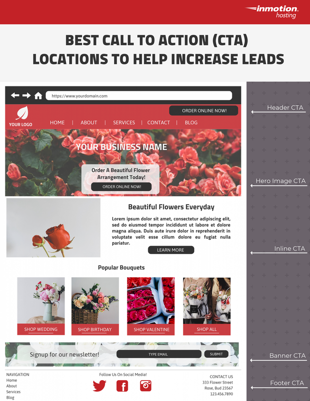
To avoid confusion, your website should only have 1-2 main calls to action. However, they can be placed in multiple areas on your website. The below infographic will guide you through the best CTA placements for increasing engagement and leads.

Customer Communication
Contact Forms
Contact forms are one of the most powerful tools for digital marketing and increasing your online business. Forms capture the contact information of your audience and can be used to gain information on their interests and needs. This data is invaluable in your efforts to increase your business. You can add fields to your contact forms to gather additional information — like which particular service they are interested in, custom products/services they need, or even specific pain points they are experiencing. All this information will help you tailor your response to them, your future products/services, and the messaging on your website. It’s a free, easy way to gain insight into the minds of those directly interacting with your business and your website.
Likewise, you should also consider integrating newsletter email capture tools into your website. Email marketing platforms, like MailChimp, allow you to capture emails and save them in an email list you can then use to send marketed emails to further promote your business. Even better, MailChimp has many free templates you can use when planning and designing your email newsletters.
Live Chat
Another great way to increase your online business is to integrate a live chat option onto your website. Similar to a contact form, a live chat allows you to collect questions and insight from those who are directly interacting with your website.
However, while forms allow website visitors to carefully craft their responses, a live chat will give you candid feedback about your business and your website. All feedback is helpful but raw, candid feedback will allow you to obtain initial frustrations or joy. Data around first impressions will give you needed insight for future website and business decisions that will encourage visitors to stay on your site longer — eventually leading to new sales.
Learn how to get your business online quickly with our comprehensive PDF guide!
Though the above may seem overwhelming, remember you will be adding the majority of these elements to your website anyway. This article is to help you strategically implement elements to increase your online business. For more website and branding tips, check out our Web Design Education Channel!