
When you think about a website header, do you think of the bar at the top where the logo and the menu resides? You’re not wrong, but most recently some may think of the header to be everything above the fold. This means that when visiting a website, if you don’t scroll down, the entire section that is displaying is the header.
Let’s take a look at several websites that have a variety of headers and discuss what we see each website is aiming towards with their design.
Box.com

Box.com’s header isn’t just a logo and menu, but rather a full preview of their product along with a call to action front and center. If you have a special or a new product, this type of header is a great way for your visitors to easily find and learn more. For new products, you don’t have to keep the call to action (CTA) front and center, you can use this spot temporarily and then change to a different style of header.
Box does a great job of making their action buttons easy to find. The simple, clean style is easy on the eyes. This header is built around getting visitor information though either a free trial or contact form.
Apple.com
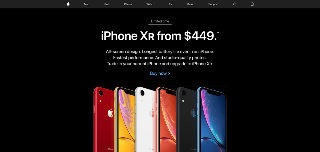
Apple’s header style is driven around the product. Instead of showing off all of the features of the new iPhone on their header, they just show you the product. This sparks curiosity. The header is focused around a sale that they are running for the holidays. It’s simple and clean, and it drives the user to click to learn more. This header is built around a desire for visitors to learn about (and purchase) the latest and greatest technology.
BearsBeans.com
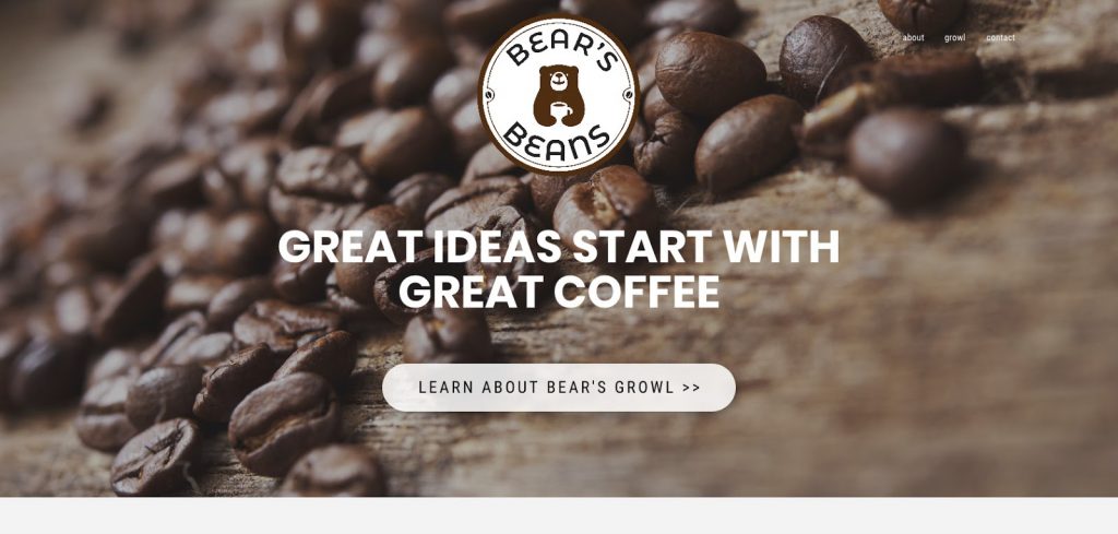
Bear’s Beans has a super simple header. It very clearly communicates what the brand is about, yet it also appeals to curiosity. From the start, the logo, small menu, and very clear call to action make you want to try a sip of their coffee. In this case, they are only using four total elements; a logo, headline, button, and menu. The size of the text allows the website to be very eye catching. As you can see, there isn’t any defined section between the menu bar area and the lower CTA. This is why we would call the whole section a header. The header takes a simple, relaxed approach at educating the customer.
BestBuy.com

Best Buy uses their first header to help visitors find information about gift cards, local stores, shopping carts, products, accounts, order statuses, and a search bar. In this case, the whole section above the fold wouldn’t be called a header, as it’s clearly sectioned off to a scroll where they have highlighted sales and products. This header provides an easy way for visitors to complete a sale. Best Buy does a great job at fitting a lot of information in a small space without making it look too crowded.
GettyMusic.com
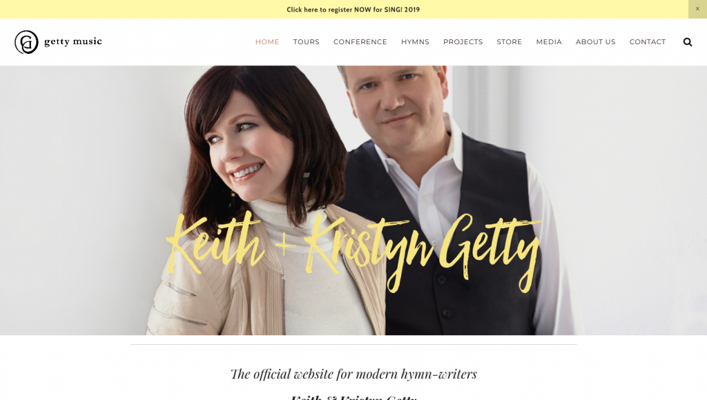
Getty Music’s header is simple in its own kind of way. Not only do they spread out their menu items to fill the majority of the bar, they have also used a simple photo with some text below it. This image isn’t calling for action, rather it’s placed for brand recognition. Even though Getty Music has a store, they do not have a shopping cart icon in their menu. This takes a way the e-commerce side of their website and makes it feel more informational. This header gives fans and visitors an opening to engage with the music and events described within.
WissmannFamily.com

The Wissmann Family header is a modern way of building brand recognition as well as driving sales for their music. The color scheme combined with the CD and logo colors brings a relaxed feel. The menu icons and placement state that the website is about sales and connecting with visitors via social media.
What Did We Learn?
After looking over these six websites, what did we learn about proper header layouts? Is it that one header will fit all styles of websites? Obviously not. Here is what I learned:
- The website header can extend all of the way to the website fold.
- The types of icons used in a header can express the overall purpose of the website
- All header images don’t have to be used for calls to action, but can also be used for brand recognition.
- If you have a store on your website, it isn’t a requirement to have a shopping cart icon in the header.
- All six examples have one thing in common, they all have clean and simple headers. The colors match the rest of the website and all the content flows smoothly.
What did you learn? No matter what level of design expertise you’re at, spending time reviewing successful websites can help you grow your knowledge of proper header layout for websites.