If you have a website, you have a call to action (CTA), whether you realize it or not. At the most basic level, a CTA is a design element that entices the visitor to take a certain action, whether it’s signing up for an email list or purchasing a product.
And there’s no such thing as a successful marketing campaign without a successful call to action.
Leads, conversions, profits, and even repeat sales all rely on CTAs. If you haven’t been paying much attention to what messages you’re sending out, it’s time to start. We’ve put together this simple soup-to-nuts guide on CTAs, what they are, and how to use them.
- What is a Call to Action
- Why are CTAs Important
- What is the Purpose of a CTA on Your Website?
- Call To Action Types and Examples
- Where to Place CTAs
- Do I need CTAs on my Website?
- How to Create a Persuasive CTA
- Conversion Rates Observations
What is a CTA?
CTA stands for “call to action,” which is a prompt or statement designed to get an immediate response from the audience. It is, literally, a call to take an action.
They’re regularly used in business as part of a healthy SEO strategy, and they’re generally placed at the end of a sales pitch or other content to let the readers know what they should do next.
It’s typically written as a command, such as “Buy Now,” “Sign Up Today” or “Contact Us” and could be in the form of a simple hyperlink, an icon, button or many more options.
The best call to actions entice and compel the visitor to take immediate action, whether it’s purchasing something, signing up, downloading an ebook, or anything else your marketing campaign is promoting.
Without a clear call to action in multiple places on your website, your visitors may move on to other websites after looking for a couple of seconds.
In other words, customers need guidance when they visit your website and a call to action is the way to give it to them.
Why Are CTAs Important?
A call to action lets your readers know what they should do next.
Your goal is to keep them on your website as long as possible, and the best call to actions do exactly that.
Guide them to your next most relevant blog, provide them with a link to a relevant product, or even show them how to sign up to receive your blog updates.
Without a clear CTA, the reader will likely leave your site after getting the information needed and may not return.
Any good marketing plan will make it as easy as possible for customers to navigate through your expected sales funnel.
Of course, if a customer visits your website specifically to purchase a product, then they will figure out how to do it on their own.
But you can’t rely on every customer to come to your website with that mindset.
When you base your marketing plan around lead generation, you can think about what will make your CTA most effective in creating new potential customers.
What is the Purpose of a CTA on Your Website?
Beyond achieving the final end-goal (whether it’s a purchase, a sign-up, or something else), CTAs are useful in a variety of ways:
- They help visitors transition between various phases of the buyer’s journey. A CTA prompts the reader to act, perhaps to give you contact information or download an eBook. Why? The easier you make it to take the next step in your sales funnel, the more likely people are to take it. Your CTA creates a better user experience: you tell your audience exactly how they should proceed rather than making them guess.
- Customers expect to find a CTA. We live in a world of convenience, and people don’t want to have to search for information. As such, many people depend on a CTA at the end of the page or the bottom of the image to tell them what to do next. For example, if you publish a video with a new product demonstration, you should provide a way for the audience to purchase at the end. Or if you write a blog announcing your new coaching service, you might include a “Sign up for Your Free Consultation” button at the bottom.
- They enhance your digital advertising. Any advertising campaign you run is about generating hype for a product or service and grabbing the audience’s attention. A call to action provides that last little push that many people need before they take the bait. They’re especially important in paid advertising, such as PPC ads or social media promotions, because . . . well, why pay for an ad if you’re not going to give the audience a clear way to make a purchase? That’s just wasted money.
Call To Action Types and Examples
If you’ve ever visited a website, you’ve seen a CTA. Often, they blend seamlessly into the design, so you may not even consciously notice them. Some common call to action examples include:
- Special Gift Giveaway – Enter your email address and be entered to win a free iPad Pro.
- Free Instant Trial – Sign up for a trial of our software and we’ll add an extra 30 days.
- Free Download – As a way to say thank you, download two tracks from our most recent album.
These are just a few effective call to action examples. Each one of these CTAs would have a button or a field directly associated with it to capture the customer’s email address.
As you can see, a CTA usually encourages the reader to take an action they were likely to take anyway, so they don’t really come off as blatant marketing or sales pitches, but more like a helpful reminder.
Lead Generation
One of the first things you want to do with your website is to convert a one-time visitor into a potential lead for your business. Generally speaking, you want to put these CTAs in a spot that will be quickly seen by the visitor, such as a header at the top of the site or a sidebar that is visible as soon as they open the page.
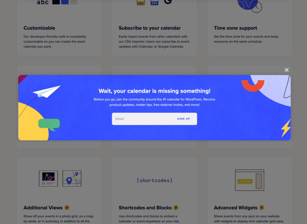
Others have started to use pop-up windows that cover the text of the main page with messages such as “Learn How to Run Your Website Effectively.” By stating exactly what they will get out of this call to action, you are increasing your chances that the visitor will click through.


Sign-Up Form
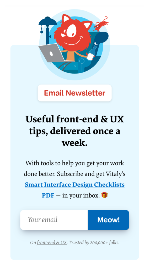
The next step to adding these visitors to your lead list is to have them sign up with your website. This call to action should include a detailed description of what benefits they will get if they sign up for your newsletter. If you are offering monthly investment tips or weekly Internet security tips, then let them know what they will get by entering their information and hitting the submit button.

Service or Product Discovery
These lead the visitor to products or services offered by the company, and you can use them across your site. One common tactic is to include internal backlinks within your blog or other content.
Say goodbye to slow loading times and hello to high-performance websites with our new WordPress VPS Hosting plans. Experience 40x faster WordPress page load speeds on purpose-built servers that guarantee 99.99% uptime.
High-Performance VPS
Fully-Managed Support
Free SSL & Dedicated IP
Advanced Server Caching
Continue Reading
If you are posting a blog or long content pieces, you will not be able to keep people scrolling down through page after page of text. Instead, you want to split these into multiple pages, preferably with a chunk that is only about one screen long. Here, the “call to action” is in the form of a “Continue Reading” or “Read More” arrow button that moves them on to the next page.

Event Promotions
These CTAs alert your audience to special events or promotions. Again, they can be used across your website. BoldGrid makes it easy to add an events calendar to your WordPress website, and then drive your audience to that calendar through the use of banner ads, pop-ups, and more.
Social Media
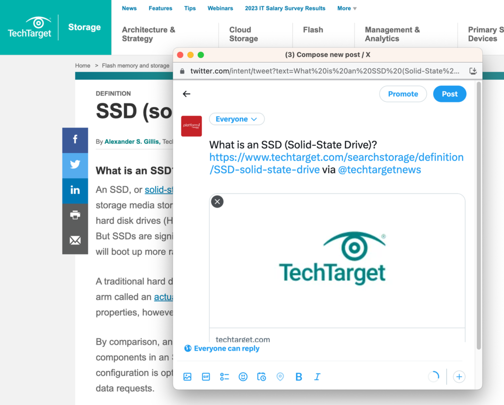
Once your visitors have finished reading your blog, you need to prompt them to share this great content with their friends. This means providing them with a call to action that encourages sharing this post on social media. You should make sure to include social media buttons to help aid with this.
Where to Place CTAs
Where you place your call to action depends a lot on what type of call to action it is. Usually, CTAs can be lumped into two main categories: Soft CTAs and Hard CTAs.
Soft CTAs
A soft CTA is when you ask someone to take an action that isn’t your main desire but is a step towards it. For example, if your end goal is to make a sale, you might start by asking them to sign up for your email newsletter list. You might follow that up with another soft CTA within the newsletter, asking them to sign up for a free webinar. Each step serves as an opportunity to get them more interested in your product and should, ultimately, lead to a purchase.
On a website, soft CTAs make more sense below the fold, while hard CTAs should be placed above. Why? Soft CTAs give you the opportunity to spread your message throughout your content, depending on where it makes the most sense. For example, you might include internal backlinks to related content within your blog posts, or insert a button for a free consultation at the bottom of your newsletter. The goal is to keep visitors interested in your content and moving around your website so they can continue to learn more.
Hard CTAs
Hard CTAs assume that the visitor is already aware of the product and ready to buy. There is no need to keep them bouncing around your website, looking at additional content: they arrived knowing that they want to make a purchase and you just need to facilitate that.
However, if the average person is just interacting with your blog or website for the first time, they are not very likely to make an immediate purchase. They’re not familiar with your brand or the benefits your product offers, so by jumping straight to the sale, you’re missing out on the opportunity to convert more people.
In a nutshell: if there is content somewhere, you can include a call to action.
A/B Testing
To truly determine the effectiveness of your CTAs and which location works best, you need to perform A/B testing. Running an A/B test simply means using two or more versions of the same ad in different ways and then analyzing the results. So, for example, you may place the same call to action in the sidebar and within the text of a blog post, and then use analytics to determine which one performed better.
A Note on Mobile Devices
Nearly 60 percent of all website visits today happen on a mobile device. That means it’s an audience you can’t ignore. And mobile visitors want convenience and simplicity. They want to find what they’re looking for quickly, without scrolling or bouncing from page-to-page. When it comes to your mobile website, it makes sense to place CTAs in a clearly visible location, higher up on the page.
Do I Need CTAs on my Website?
A good CTA will help move a visitor along through your sales funnel, leading them to other relevant information and keeping them engaged. Over time, this engagement could lead to further action, such as a sale or referral.
Might they end up in that place on their own without a CTA? Sure. But it’s a lot less likely.
Without a call to action, your reader is left to fend for themselves and navigate your website on their own. And without you to encourage further action, the odds are high that they’ll quickly leave to go look at something else.
How to Create a Persuasive CTA
There are several methods you can use for creating a CTA. Below are some of the elements we’ve found most useful:
- Clean Design – This should go without saying. If you want a reader to take action, you need to make your CTA attractive. Everything from colors, to shape, to size matters.
- Actionable Text – Make the next move clear. For example, instead of “click here if you’d like to learn more about WordPress,” write “Learn WordPress.”
- Keep It Short – A call to action should be no more than a few words, not an entire paragraph, or even a sentence.
- High Visibility – Lastly, draw your readers’ attention directly to your CTA. If it’s a hyperlink within a blog, make it a different color and bold the text. If it’s a button, make sure it contrasts with the rest of the page and it’s large enough to draw attention.
Conversion Rate Observations
As with any digital marketing campaign, you will want to watch your analytics and see if your CTA is helping drive traffic to a specific page or increase conversions.
If you find that readers are not engaging with your CTA, try changing the copy, as well as the color and the placement of the button and see if that helps. If that does not help, look a bit deeper into making sure the call to action button or link is working properly across all devices.
Bottom line? If you’re running a business website and not utilizing CTAs, you’re missing out on a lot of potential sales.
In the end, a CTA can get readers to take an action, or help turn your visitors into leads, leads into prospects, and prospects into sales. CTA placement depends on your goals and what action you want your audience to take.
Adding CTAs to all of your pages including blog posts can help with driving traffic throughout your overall website. Don’t be afraid to experiment and try new things. If you want your readers to take action, it helps to offer a guiding hand.