We live in a time where there is so much information. When a designer or content creator sets out to create a new website or design, how can they compete against all of the other websites and content? What can make their content stand out?
One of the main differences between amateur content and professional content is actually not the quality of the text. The biggest difference is the layout and design of the content. One aspect of this type of design is whitespace. Whitespace is used not only in web design, but across all types of design.
Whitespace – What is it?
The concept behind whitespace is very simple. It is simply the space between text, graphics, images, and blocks. Whitespace is also known as negative space or blank space.
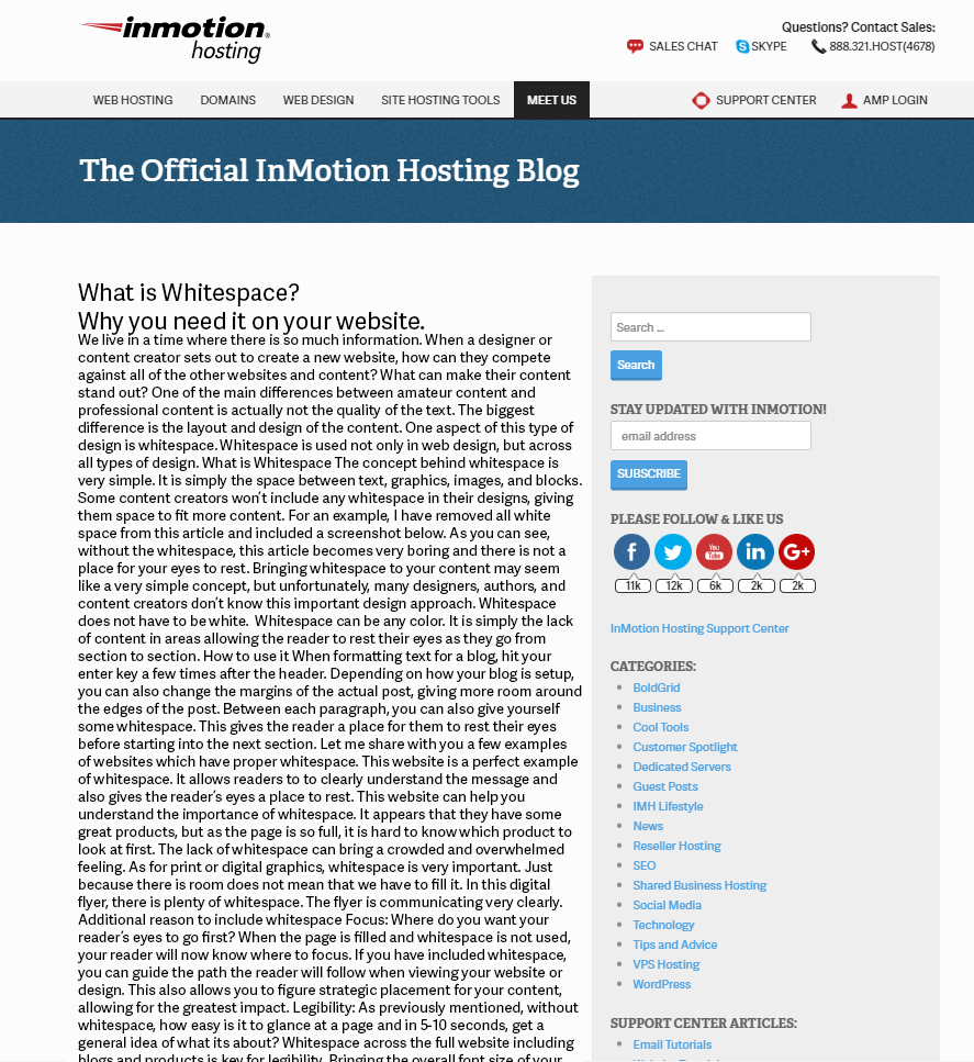
Some content creators won’t include any whitespace in their designs, giving them space to fit more content. For an example, I have removed all white space from this article and included a screenshot below.

As you can see, without the whitespace, this article becomes very boring and there is not a place for your eyes to rest.
Bringing whitespace to your content may seem like a very simple concept, but unfortunately, many designers, authors, and content creators don’t know this important design approach.
Whitespace does not have to be white. Whitespace can be any color. It is simply the lack of content in areas allowing the reader to rest their eyes as they go from section to section.
Blank Space – How to Use It
When formatting text for a blog, hit your enter key a few times after the header. Depending on how your blog is setup, you can also change the margins of the actual post, giving more room around the edges of the post. Between each paragraph, you can also give yourself some whitespace. This gives the reader a place for them to rest their eyes before starting into the next section. Let me share with you a few examples of whitespace:

This website is a perfect example of whitespace. It allows readers to to clearly understand the message and also gives the reader’s eyes a place to rest.

This website can help you understand the importance of whitespace. It appears that they have some great products, but as the page is so full, it is hard to know which product to look at first. The lack of whitespace can bring a crowded and overwhelmed feeling.

As for print or digital graphics, whitespace is very important. Just because there is room doesn’t mean that we have to fill it. In this digital flyer, there is plenty of whitespace allowing the message to be very clear.
Additional Reasons to Include Whitespace
Focus
Where do you want your reader’s eyes to go first? When the page is filled and whitespace is not used, your reader will now know where to focus. If you have included whitespace, you can guide the path the reader will follow when viewing your website or design. This also allows you to figure strategic placement for your content, allowing for the greatest impact.
Legibility
As previously mentioned, without whitespace, how easy is it to glance at a page and in 5-10 seconds, get a general idea of what its about? Whitespace across the full website including blogs and products is key for legibility. Bringing the overall font size of your copy from a 10 point to a 13 point can help with legibility, but it is very important to increase the amount of space between headers and paragraphs.
Conclusion
Whitespace is very important for every website and design. Without it, your message is not clear and without a clear message, you will lose sales. Space between your images and text change the complete message of your website. Adding whitespace to your website is not complex, it is simply just hitting enter and adding margin and padding. Start to make your website stand out by adding whitespace.
Get super fast and powerful web hosting from InMotion Hosting.
Everything Your Website Needs to Scale
Launching your website is easier than you think. With up to 80% in savings on web hosting, bringing your business online is easier and more affordable than ever. Act now to take advantage of this limited time offer.
99.99% Uptime
24/7 Human Support
100% Money-Back Guarantee
One thought on “What Is Whitespace and Why Is It Important?”