Table of Contents

The built-in display editor continues its parallel development with updates in the standalone plugin named Gutenberg. Currently, at version 12.3, the Gutenberg plugin introduces new features and changes that are eventually integrated into the default visual editor for WordPress. There are 3 new blocks in the current release; Site Logo, Post Author, and Group Block (Typography support ).
Looking for a new home for your WordPress site? Check out InMotion’s WordPress Hosting solutions for secure servers configured for your budget and performance needs.
Site Logo – Favicon
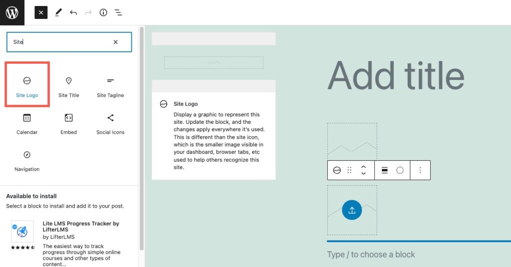
You can quickly add a page/post and then add the Site logo block to create your site’s favicon.
A favicon will generally be used as a page identifier graphic in a tab. Here’s how it would typically look in a browser:

The Block settings can be seen by simply clicking on the block, then looking at the right side of the editor. Block properties are displayed as long as the gear icon in the top right corner is selected. :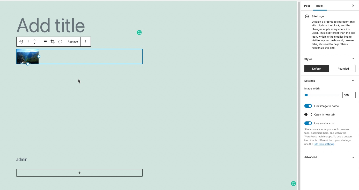
The block properties are magnified in the screenshot below.
![]()
Each of the options listed in the screenshot above are described below:
Styles – note that there are 2 styles you can select: default or rounded. Rounded will simply round the icon used in the tab. Styles represent the visual appearance that the feature will take. The favicon can appear rounded or squared (default) in a browser tab.
The Settings section includes:
- Image width – this is controlled by a slider
- Link image to home – Clicking on the image on the page or post will bring you to the home page
- Open in new tab – opens the browser in a new tab when clicking on the block
- Use as the site icon – this makes the site icon the favicon for the website. Using this icon, you can use a custom image within your WordPress site as the favicon.
When you add a site icon block, you also have options that can be applied directly from the menu bar. The menu bar is visible when you click on the block:
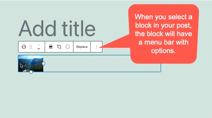
The block menu options include:
- Alignment options
- Duotone filter options
- Zoom options
- Apect Ration
- Rotate
Each of these options are described below.
Alignment options
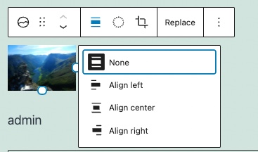
You can apply 3 different alignment options (and none) to the site icon image that you have selected. The alignment is arranged horizontally. Since the image is already aligned left, then you will not see much difference between the None and Align left settings
Here you can see the alignment of the block in relation to the title. It is set to Align center.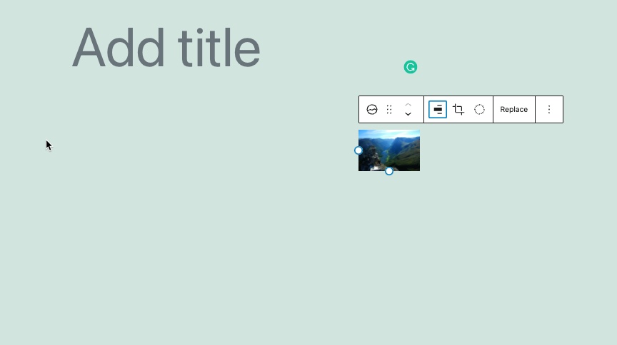
This screenshot shows the alignment set to Align right.
Duotone filter options
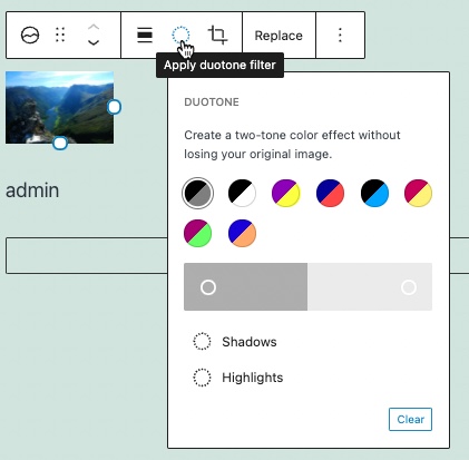
The next option is to apply duotone filters to the image. This allows you to add some colors to the image. Note that you can change the shadows and highlights. There is also an option to clear the colors that you have selected.
Zoom options

The image can be zoomed in using the slider.
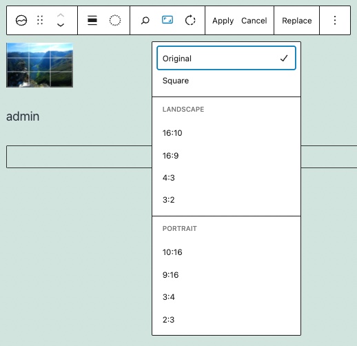
Aspect Ratio
You can change the aspect ratio of the image used as the site favicon. Select the ratio you want to use and then click on Apply.
Rotate Option
The final option for the site icon is the option to Rotate the image. This allows you to rotate the image being used in a clockwise direction. Make sure to hit the Apply button once you’re done.
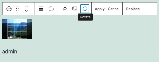
Using the options for the Site Icon make it flexible to use as your favicon graphic.
Post Author Block
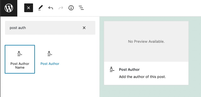
The post author block is a simple block that can be used to identify the post’s author. It sounds very simple but apparently has been on the waiting list as the desired block for Gutenberg for some time.
The Block settings can be seen by simply clicking on the block, then looking at the right side of the editor. Block properties are displayed as long as the gear icon in the top right corner is selected.
Post author block settings
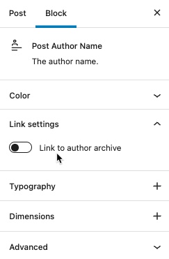
Note that the properties for the post author block are fairly basic. They include the option for color, link settings, typography, and dimensions.
- Color – color can be easily adjusted for the text, background, or link used in the Post Author block
- Link Settings – Allows a user to click on the Post Author name and then see a list of the Author’s archives in the WordPress installation. Clicking on this option will also reveal the option to see the results in a new tab.
- Typography – clicking on this property will give you access to change the font size, appearance, line height, letter case, and letter spacing used by the text in the Post Author block
- Dimensions – is actually only the padding setting for the space around the Post Author name text. The 4 sides of the Post Author block are linked by default. This means that any change to the padding changes it on all sides. You can also select to unlink the sides, then indvidually set each padding width (in pixels) for each side. There is also an option to reset the padding as needed
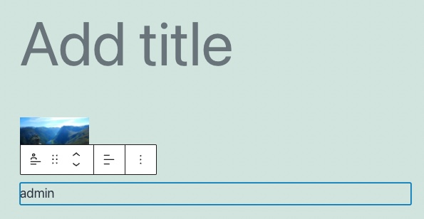
Here you can see that the Author block is labeled by the user name – Admin. It is very important that you use a more relevant name to be more explicit when referencing an author on your site.
Group Block – Typography Support
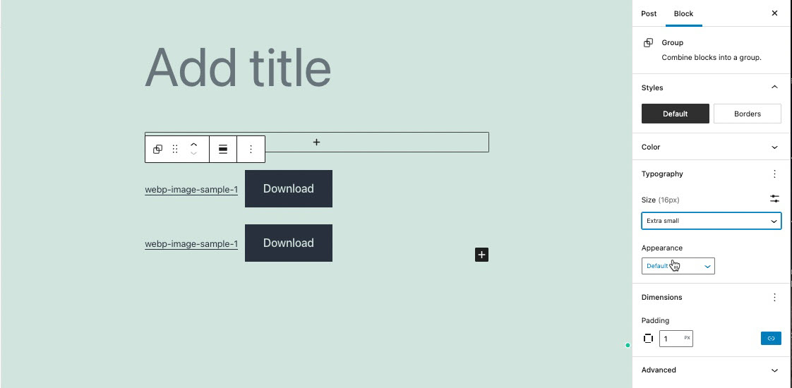
An important change milestone is the behavior of font support across multiple groups of blocks within your post/page. This change allows you to control the typography used within multiple blocks in a group.
The easiest way to see how this support has been implemented is to observe how changing a typography property in a group block affects all of the blocks in the group.
In the screenshot below you can see a group of text blocks, with typography being able to be modified in each block since they are text blocks.
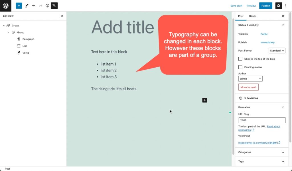
The main advantage of the support for typography in group blocks is that you can make a change in one place and affect multiple blocks within that group. The easiest way to select the group block is to go to the list view by clicking on the block resembling a list in the top left corner.
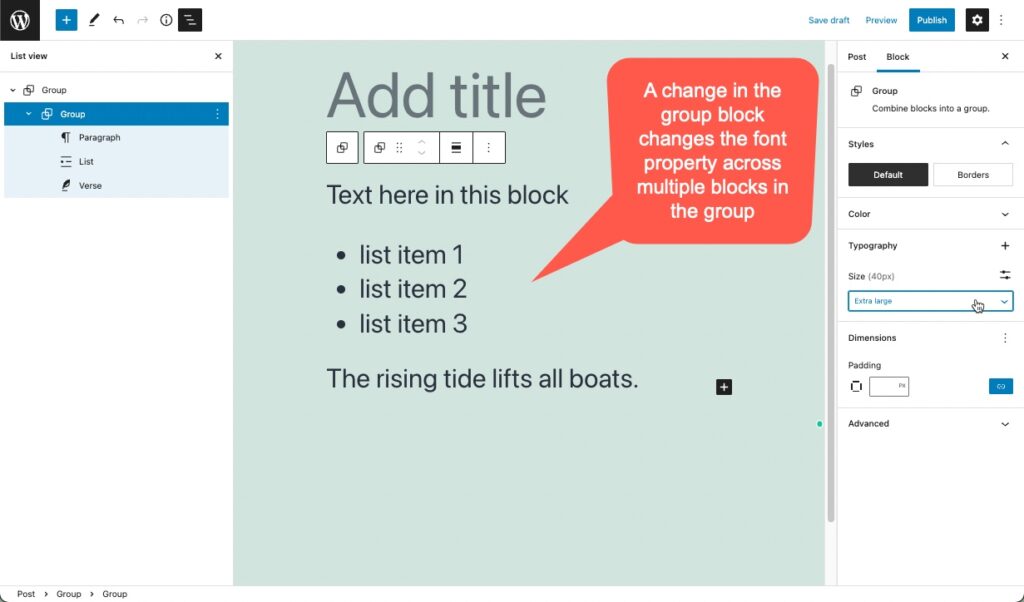
Notice that the group block was selected in the block list on the left. A change was made to the group block’s typography settings – the font size was made much larger. You can see that the text in all of the blocks within the group have all changed their font size to match the setting in the group block.
This change makes it possible for users and designers to change font families and sizes in all child blocks. Spacers block can use custom units and paragraphs can be assigned to a font-family.
Gutenberg continues to make viable changes that will eventually be a default part of the core files for WordPress. To get a jump on using the newer features of the new WordPress visual editor, make sure to use the latest version of the Gutenberg plugin with your test. As always, remember that these features should not be used in a production environment as they may be features that are continually being changed/improved.
To learn more about using WordPress, make sure to check out our WordPress Educational channel.
