Using images in your post and page content is often necessary to help emphasize your message. Visual aids draw the eye and can create a powerful contrast. And when it comes to contrast, presenting images side by side is a great way to make powerful statements. In this article, you’ll learn how to set images side by side with the column block, row block and patterns.
- Create Side by Side Images Using Column Blocks
- Using Patterns for Side by Side Images
- Using the Row Block for Side by Side Images
- How columns collapse (and how to avoid it)
Create Side by Side Images Using Column Blocks
The easiest way to create side by side images (and perhaps the best way, considering your needs) is to use the all-purpose column block. Column blocks create evenly spaced, mobile responsive columns that can accept multiple kinds of content — including images, text, and more.
- Log into WordPress dashboard
- Select a post or page to edit or create new contact
- Use the plus sign to create a new block

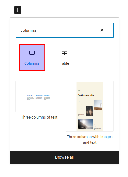
- Choose Columns

Once you have selected a column block, you can choose the orientation of the columns. You have your choice of various width ratios by percentage of the total width of your content area:

For example, if you choose 50/50, you will have two evenly spaced columns dividing the total width of the area by exactly half.
Using Patterns for Side by Side Images
Another way to get a formatted group of blocks to show images is to use patterns. Patterns are predefined groups of blocks and may often have a format and appearance that you want to use. Patterns can be obtained in a particular theme or you can go online to the Pattern directory on WordPress.org.
The theme used in the example below is the Twenty Twenty-two theme. There is a pattern for a side-by-side image with text underneath it.
- Open an existing post or create a new one.
- Select the location where you want to add the images and then click on the + sign in the top left corner of the editor.
- You will see blocks and patterns immediately beneath the Search field. Click on Patterns.
- Scroll down until you see the pattern with the image of two birds side-by-side. Click on this pattern to add it to your post.
- You can customize the pattern to replace the images with your own. When you’re finished, click on Save as Draft, Publish, or Update in order to save your changes.
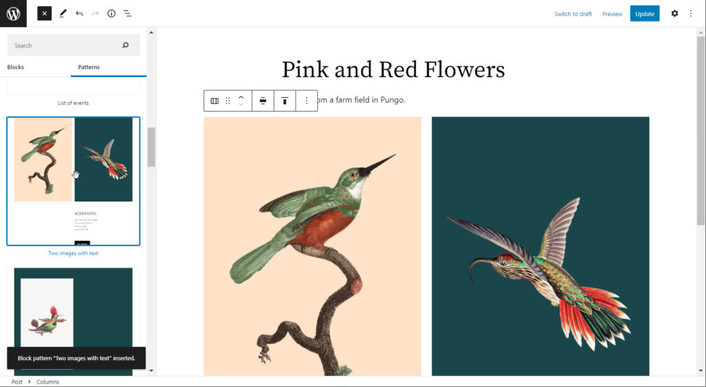
The example above shows the pattern for images in a side-by-side format.
Using the Row Block For Side by Side Images
There is another block that can be used to place images side by side – the row block. When you work with patterns or blocks, it’s best to open list view to see what blocks are added to your post. Follow the instructions below to learn how to use the row block to add adjacent images to your content.
- Open a post or create a new one.
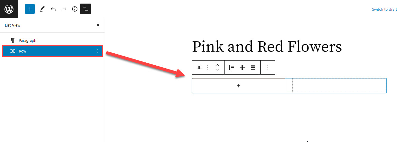
- At the top of the editor in the left corner, click on list view.
- Select where you want to add your images using the row block. Click on the + sign in order to add a new block.
- Search for “row” or scroll down through the blocks to find the row block in the design section.

- Click on the + sign, then select the image block. Add an image.

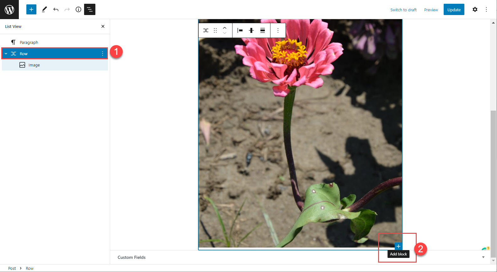
- Once the image is loaded, you will need to click on the row block in the list view. This will help to display the + sign at the bottom of the row so that you can add the adjacent image.

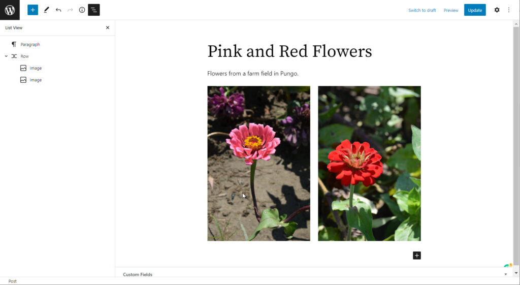
- When you click on the Add block + sign in the row (which is blue as per the screenshot), you’ll be able to select the next block as an image.
- Upload or choose an image from the media library. Click on Save as Draft, Publish, or Update to save your changes.
You can see the row in action here with two images. Like columns, you are not limited to only two images, but space on your page will become a factor when adding images in groups.
How Columns Collapse And How To Avoid It
The column block provides you with perfectly placed mobile responsive columns. What does that mean? Mobile responsiveness is a design technique that ensures a website can be properly viewed and interacted with on mobile devices. In the past, many websites were designed primarily for desktop computers, resulting in a poor user experience on mobile devices.
But today, more and more people are using mobile devices to read your website, so it’s important to make sure the site layout is mobile responsive. Mobile responsive design helps to improve readability by making text and images resize automatically to fit the screen size of the device. This makes it easier for mobile users to find the information they’re looking for without having to zoom in and out or scroll around. In addition, mobile responsive design can also help improve click-through rates and conversion rates by making it easier for mobile users to navigate your website.
When in doubt, you should choose the responsive design.
However, if you want your images to always be side by side in all circumstances, the automatic behavior used by responsive design may not be desirable. If this is the case, you have a few options for a workaround.
Compose Your Images Side By Side In a Single File
Using Photoshop, or some other desktop image application, you can compose a single image file containing both of your desired side by side images aligned just the way you want. Upload this file to WordPress, and you can be certain that your desired layout will be retained.
Create a Table
The rules of mobile responsiveness apply differently when it comes to tables. Table data must always retain its initial orientation. This means a table will never collapse in a mobile view.
Creating a table is easy.
- When creating a new block, as described above, select table instead of column.
- Select 1 row, 2 columns

- While inside a cell, click the arrow dropdown and choose inline image
You will find the arrow dropdown in your main toolbar, as seen in the image below:

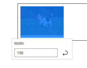
Once you have selected an inline image for the table cell it will appear small, but you can adjust the width to increase the image size. However over the image and you will see the width controls:
So there you have a few ways of creating horizontally aligned images in your WordPress blocks using the Gutenberg editor. If you have any questions or comments feel free to drop them below this article. Also consider checking out the full guide on using animated gif images in WordPress.
