Table of Contents
Hi my name’s Kevin O’leary I’m the ux lead on Spark at Acquia what I want to show you today is some of the work that we’ve been doing on edit in place.
Basically the goal here is to try to bring together work that we’ve been doing in edit module for editing the fields in the node with work that already existed in Drupal 7 such as the contextual gears and local task tab the three of these things kind of presented different ways of working with things that are right on the front of your site but they offer three different interaction patterns to do that so our goal here is to try to bring those three things together into a more unified interaction pattern for the user to be able to deal with anything that’s right in place on the front end of their site.
User Interface Problem
So there’s basically four parts to this problem. First off, the conflicting patterns in the different UIs here are confusing the users. The second is that the tasks in themselves aren’t intuitive enough, and the third is that there’s unnecessary information all of these forms that’s slowing the user down, and then the last is that the interaction patterns don’t really work for tablet devices.
Current State of Editing Content
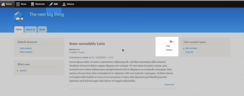
Let me just give you a quick overview of how it works right now in Drupal 8. This is a promoted node that’s on the home page and I see that I have a a contextual gear here so that I have some operations as I can perform, I can edit or delete. But then I also have this edit up here so right off the bat we have two sort of different ways of accessing this content.
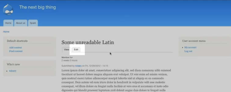
The edit from the contextual gear brings me to the full note edit form in the overlay the edit tab brings me into edit mode and then I can click into the various fields so once I actually click through and I am actually looking at the node itself now I see yet another interaction pattern here which is I have this edit tab which again brings me to the full node edit form in the overlay and then high again also still have the edit tab then from edit module.
The New Design for Editing
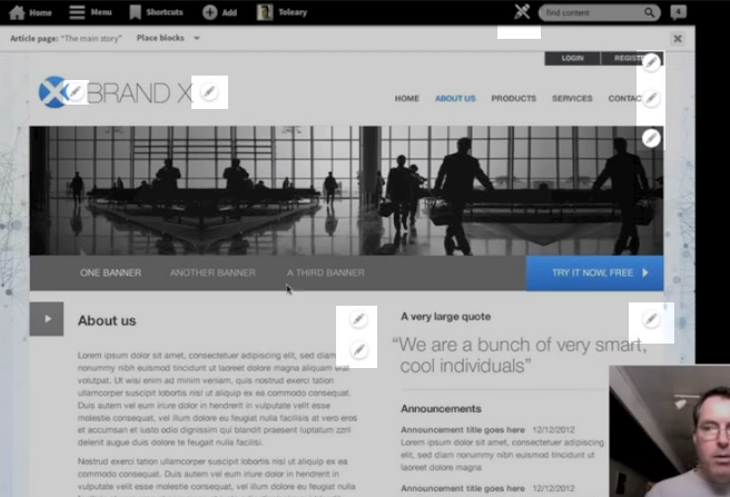
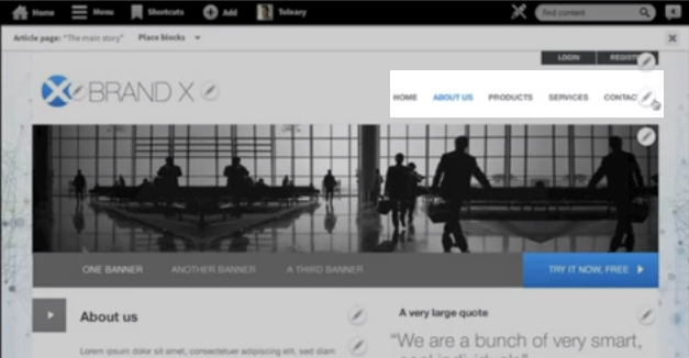
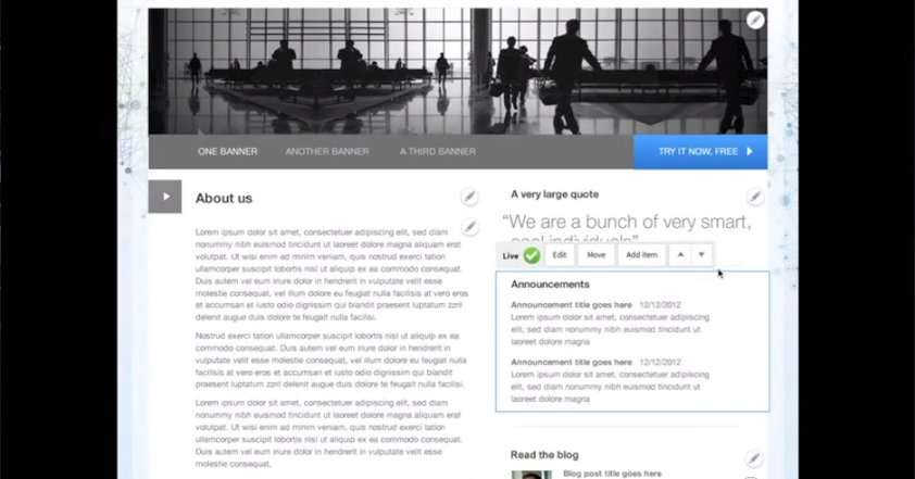
So what you’re looking at is the new design that we’ve been working on up for this unified interaction pattern. And you can see up here on the top you have this pencil icon and this is the toggle for edit mode so when we toggle on the edit mode you can see that there’s a number of pencil icons across the site which are the affordances for things that can be edited so instead of having your local task tabs and the gears with the drop down for for blocks and then the edit tab at the top for toggling on and off edit mode, everything is done with the same affordance so if I want to edit this menu here I simply click on that and now I can see some options of things that I can do were found one at it this block. I can edit that or if I want to edit one of the fields of the node like the title field or the body fields I simply click on those things and edit them directly.
Adding and Editing Menus
So I’m back in a D8 install now and Im going to show you how I would add a menu like so I have a menu over here, a user account menu and I click this links and now I can see that in the overlay I have an ad link button up here so if I add a link now I’m in the add link form and this is an fairly complex form simple for Drupal but I think for for for an average user fairly complex form there are actually about a hundred and fifty five words on this page an eight form elements so that’s quite a lot for the user to grok and users usually feel as if they should read through all of this or at least skim through it in case there might be doing something wrong. So I would add a menu link title.
The Current Menu Edit Process
I’ve created a node before that I’ve called Stunning typography, but now when I get to the path fields here there’s a problem because I don’t know the path and I may not even know what a path is. I have some descriptive text down here that I can read to sort of describe that to me but what would really be great here is if I had a an auto complete function so I could start typing something and it would it would it would bring that up so since I don’t know the path I’m going to need to go and find the path. So I have to close the overlay, go to menu. I have to know that my paths would be found by going to the actual content I can see going to the content that I have this node and now I can click on the node itself. Again I would need to know this. And then to find the node path up here which is node six, so I copy node six and now I go back to list links add link and then paste nod six. So that’s a pretty roundabout way for me to get to here. And then if I save and put back into the list links UI, the user is going to save that configuration because the expectation the user is that if I’m in a modal I need to save it or else my changes are going to be lost and now I’m going to close it and I see that my link has been added.
New Menu Editing
So let’s have a look at the same task in the new design I go to the edit toggle and toggle it on and let’s take this menu right here, the main menu say I wanted to add a link to this menu, I simply click on the on the edit affordance and I see add link right there so I can and now I get a modal and this modal gives me the opportunity to give the link a title and then in the auto complete field where I can see some human readable names of pages in my site and then I can click one and it’s going to automatically put in the path. 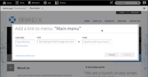
If I already knew the path I could just typed it in here and just completely ignore this middle field. And then I can submit that and a like is added.
Block Editing
So let me talk just a little bit about the tough affordances that we’ve employed here in this design. When you have the edit mode toggled on and you go to a block you can see rather than the dropdown we have this sort of bar of buttons and the sizes and shapes of the buttons are optimized specifically for touch devices. A design which is gonna enable us to have them, you know, not interfere with content that is here and yet present all of the things that the user is going to need. And then we’ve introduced some interesting new little patterns like these up down arrows which simply change the weight of the block to move it up above this block above it or down below the other block here.
Recap
So just to review, we started out with conflicting patterns that confuse the user by giving them two different ways to do essentially the same thing and we’ve unified that into a single interaction pattern for editing anything that you can see on the site page. Second, we simplified the interaction patterns so that the user can quickly get to the thing they want to have edited, edit it, and then return to the site page that they’re working on. Third we streamline the whole process by simplifying the forms and hiding all but the most essential fields that the user needs to perform the task. And last we optimized the whole experience for touch devices by removing hover, adding the toggles so that all of the affordances for edit appear at once, and increasing the size of the touchstones for all of the actual contextual links themselves.
So these designs have already been through several rounds of testing and so far the test results have been really positive. We found that current Drupal users find this to be a much more intuitive experience for editing than they’re used to in Drupal and non Drupal users have found it to be comparable to other apps that they use on touch devices. So we’re going to continue to test but we’d also like people in the community to have a look at the prototype which will be available online and .. also test it and give us your feedback as we move to getting this implemented.
