Table of Contents
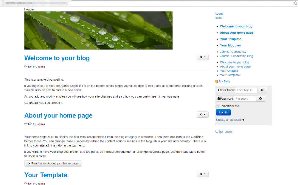
In the last tutorial within our building a basic Joomla 3.0 template tutorial series, we showed you how to add style to login form using CSS. You can see in the screenshot to the right how this added a grey background and rounded corner to the login form. You can also see however that the other items in the sidebar still do not have any style added to them.

Locating our CSS classes
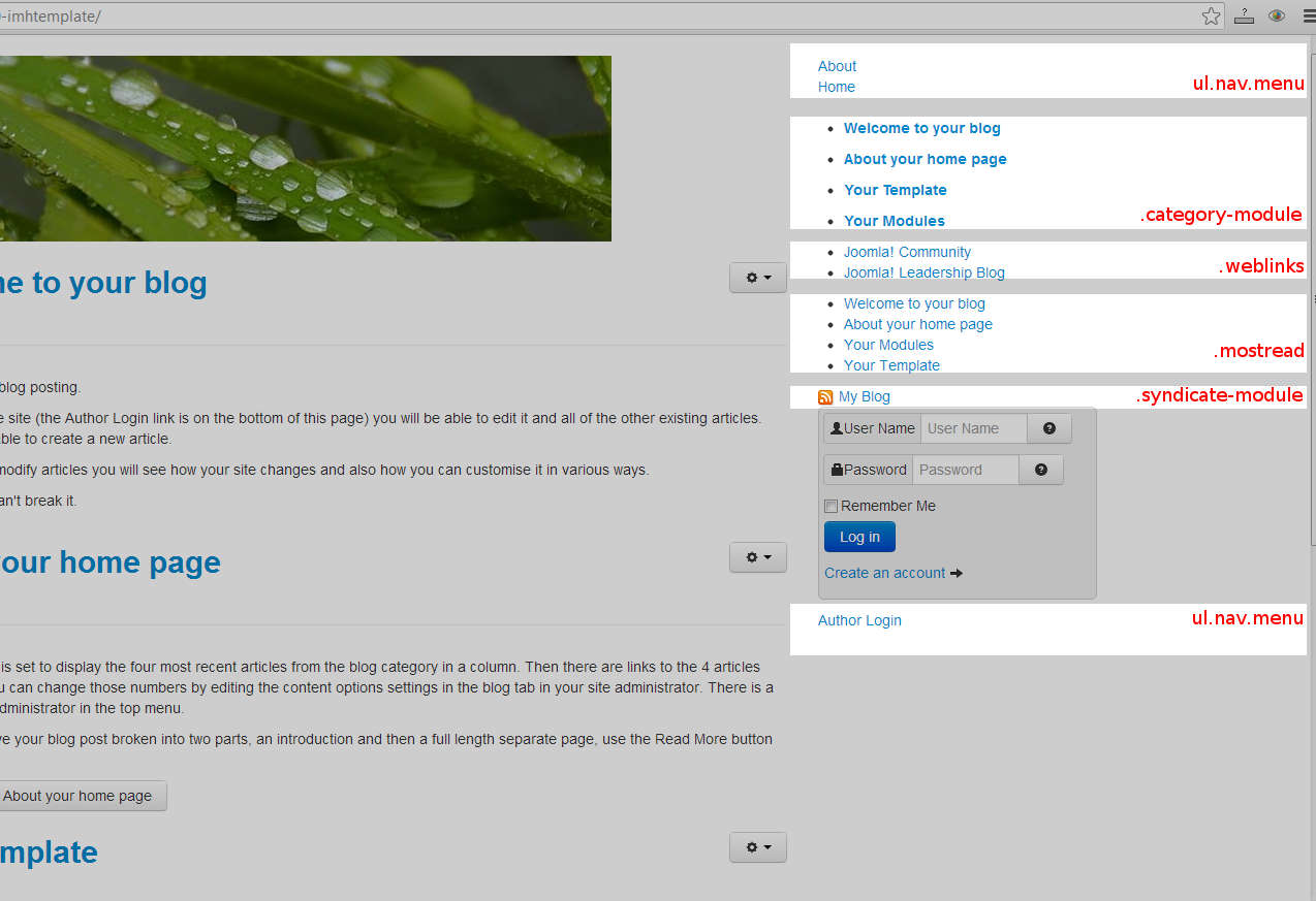
To add style to the rest of the items in the sidebar, we need to know either their classes or ids. We’ve done the work for you and labeled each section and the corresponding label we used to modify their styles (see the screenshot to the right).
As you can see, we’re working with the following items:
- ul.nav.menu
- .category_module
- .weblinks
- .mostread
- .syndicate-module
The final look after making changes
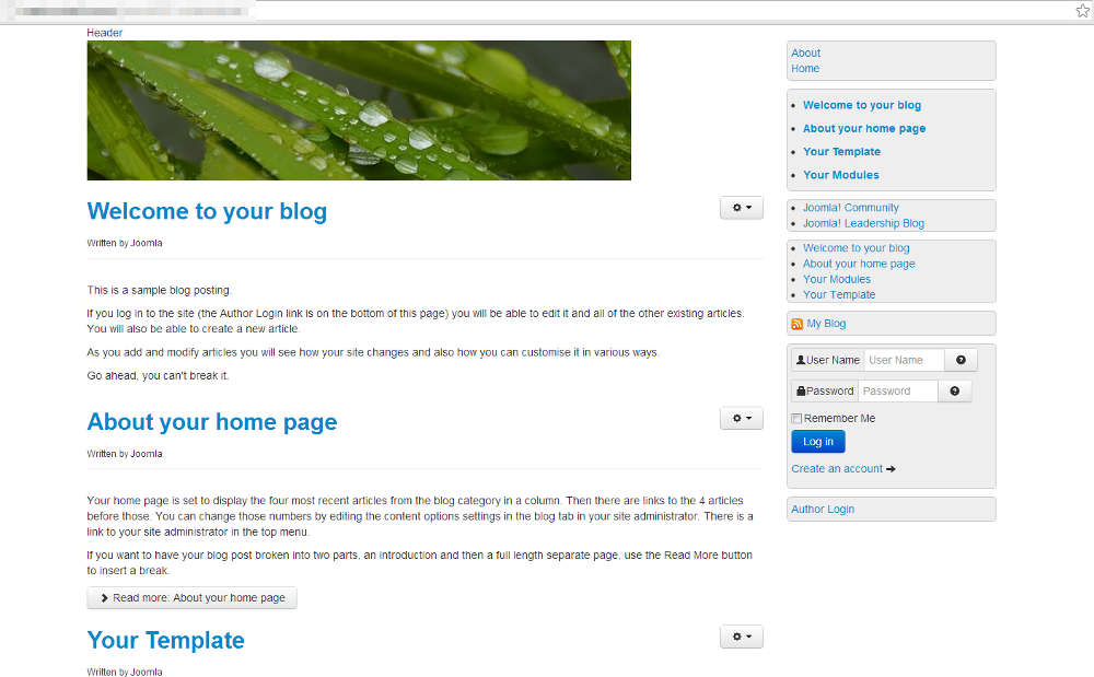
Before we show you the CSS code that we used to style the rest of the modules in the sidebar, we’ll skip ahead and show you the results. The screenshot to the right shows how our Joomla 3.0 template looks after we finished styling all of the elements in the right sidebar.
Applying a uniform style to the sidebar
Adding the rounded corners
Because our login form has a grey background and rounded corners, we’ll apply the same style to the other sidebar modules. We don’t need to copy the code we already added, instead we can add to it. In the code below, the green text is the original css code for the login form, and the text in red is the updates.
Adjusting padding on the unordered lists
Because most of the modules are actually unordered lists, we found that adding some padding to the lists made them look much better:
Setting the .syndicate-module to be a block element
Finally, for everything to appear correctly, the .syndicate-module must be set to a block element:
Our final stylesheet
After making the updates mentioned above, our css/style.css file looks like the following:

