Table of Contents

One of the more common ways to emphasize text in a Joomla 4.0 site is to use Bootstrap 5 alerts. Alerts give you a different text look, background, and in some cases even adds a small graphic.
This article will provide the code and examples of how you can add alerts to your Joomla content.
- How to add Bootstrap 5.0 Code in Joomla 4.0
- Examples of Different Alert Types
- Triggering Alerts
- Alerts with Icons
- Working with Assistive Technologies
Need a home for your newly created Joomla 4.0 website? Check InMotion’s VPS hosting services! You’ll find secure servers tailored to meet your budget needs!
How to add Bootstrap 5.0 Code in Joomla 4.0
When you’re working in Joomla, adding the code is very simple. Here’s a quick example of you how you would add the code using the Joomla 4.0 editor:
- Log into the Joomla Administrator Dashboard.
- Click on Content in the main menu.
- Add a new article or edit an existing one. This will put you into the Joomla content editor.
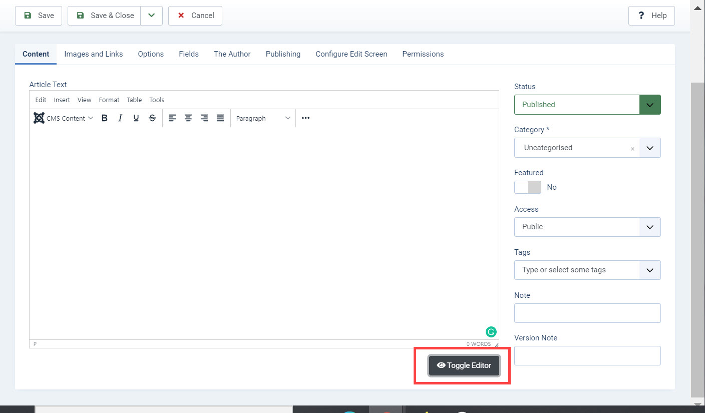
- Click on Toggle Editor in the bottom right corner of the editor. This will place the editor in text mode. You should only add code in this mode.

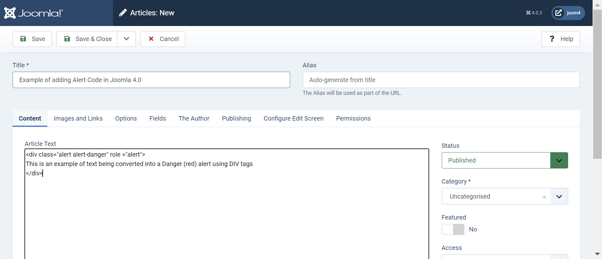
- Type in or paste in the code that you want to use.

- Once you have the code added, click on Save or Save & Close in the top left corner of the editor to save your changes.
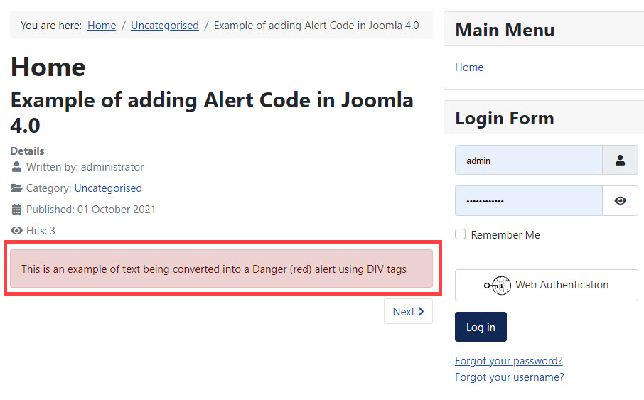
- When your code is saved you can see that there is an option to preview your article at the top of the page (next to the Save options). Click on Preview. The code is highlighted by a red box.

Examples of Different Alert Types
Using color with your text alerts can help to convey meaning to the viewer. Bootstrap alerts currently convert 8 different colors that can be used to help emphasize messages to your users. These colored alerts are defined by their name and color.
You can apply alert types to text using DIV, H, P, and span tags. The format is the same from tag to tag.
The colors may slightly differ depending on your display device and graphics card. So, to provide a better understanding of each alert type the example code will be followed by a sentence describing the background and font color of each alert.
Primary alert

The primary alert has a light blue background with the font being a darker blue.
Secondary Alert

The secondary alert has a light gray background and the type is displayed in a dark gray.
Success Alert

The success alert has a light green background and the type is dark green.
Danger Alert

The danger alert has a lighter red background and a dark red font.
Warning Alert

The warning alert has an amber background and dark brown type.
Info Alert

The info alert has a light blue background and the type is a dark blue.
Light Alert

Although it’s hard to see, there is a slightly darker background (almost white) and the type appears to be a dark gray.
Dark Alert

The dark alert has a darker gray background and the type is almost black.
The 8 alert types have distinctive colors that can be used to convey meaning for the text that you are displaying to your viewers. For example, if you are discussing a critical point, then you may want to display a portion of the text in red to show its importance.
Triggering Alerts
In addition to supplying different colors of text, you can use an alert so that it appears after you have triggered it with a button or link.
The code above makes use of a button and the collapse option provided with Bootstrap 5.0. You can click either button and then a danger colored alert will appear

Alerts with Icons
Alerts can also make use of Bootstrap icons in order to provide a small flexible graphic that can bring more emphasis and meaning to your text.
Bootstrap Icons use the SVG format, allowing you to embed the image using HTML. Bootstrap Icons also have a width and height of 1em that can be changed by using different font sizes.
Here is an example of code with an alert using a graphic:

Using the code, you can add a small icon that will help to provide better emphasis for your text.
Working with Assistive Technologies
When using colors with Bootstrap code like alerts, there can be issues with assistive technologies such as screen readers. The colors used by the code may add meaning to a text phrase, but this can’t be interpreted by the screen reader. To help provide the information for individuals using screen readers, it is common practice to use the span tag with the “visually-hidden” class. Here’s an example:

The text is generated with no issue, but the “visually-hidden” option is used to keep the text hidden.
To help your users who may be visually impaired and requires the use of assistive technologies, make sure to use the “visually-hidden” class to help provide the extra meaning that your colored alerts may hide.
Launch your web presence quickly and easily with Shared Hosting. Our user-friendly hosting is perfect for everyone, providing the fastest shared hosting experience possible, all powered by cPanel.
Free Domain & SSL Certificates
Unlimited Bandwidth
400+ One-Click Applications
USA & European Data Centers
