Table of Contents
BoldGrid provides a convenient way to see how the website would be seen in a Tablet or Phone. The option to view with these modes are found in previewing Inspirations or within Editing a Page or Post. Each template or theme is designed with the different device views in mind. The following tutorial shows you how to use them within the editor for a Page or Post.
How to use the Desktop, Tablet, and Phone Views in the Editor
- Log into your website admin interface.
- Click on either Pages or Blog Posts

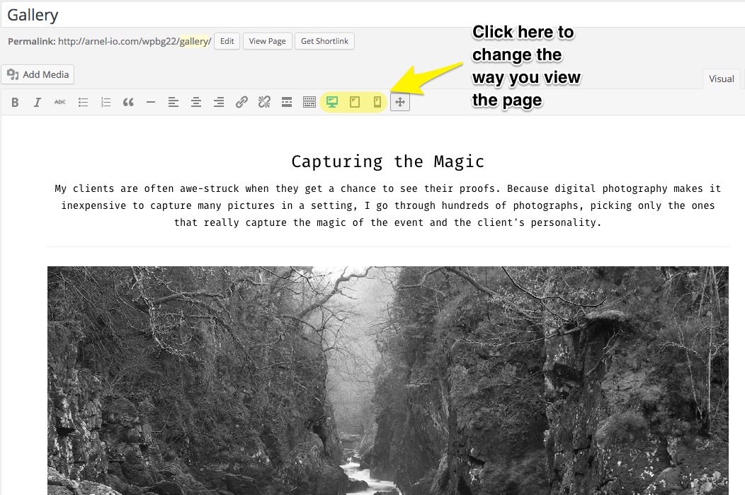
When you edit or add a new page/post you will see the option to view the content with the Tablet or Phone. By default, the view is set to a desktop view. Click in the tool bar to change the view.
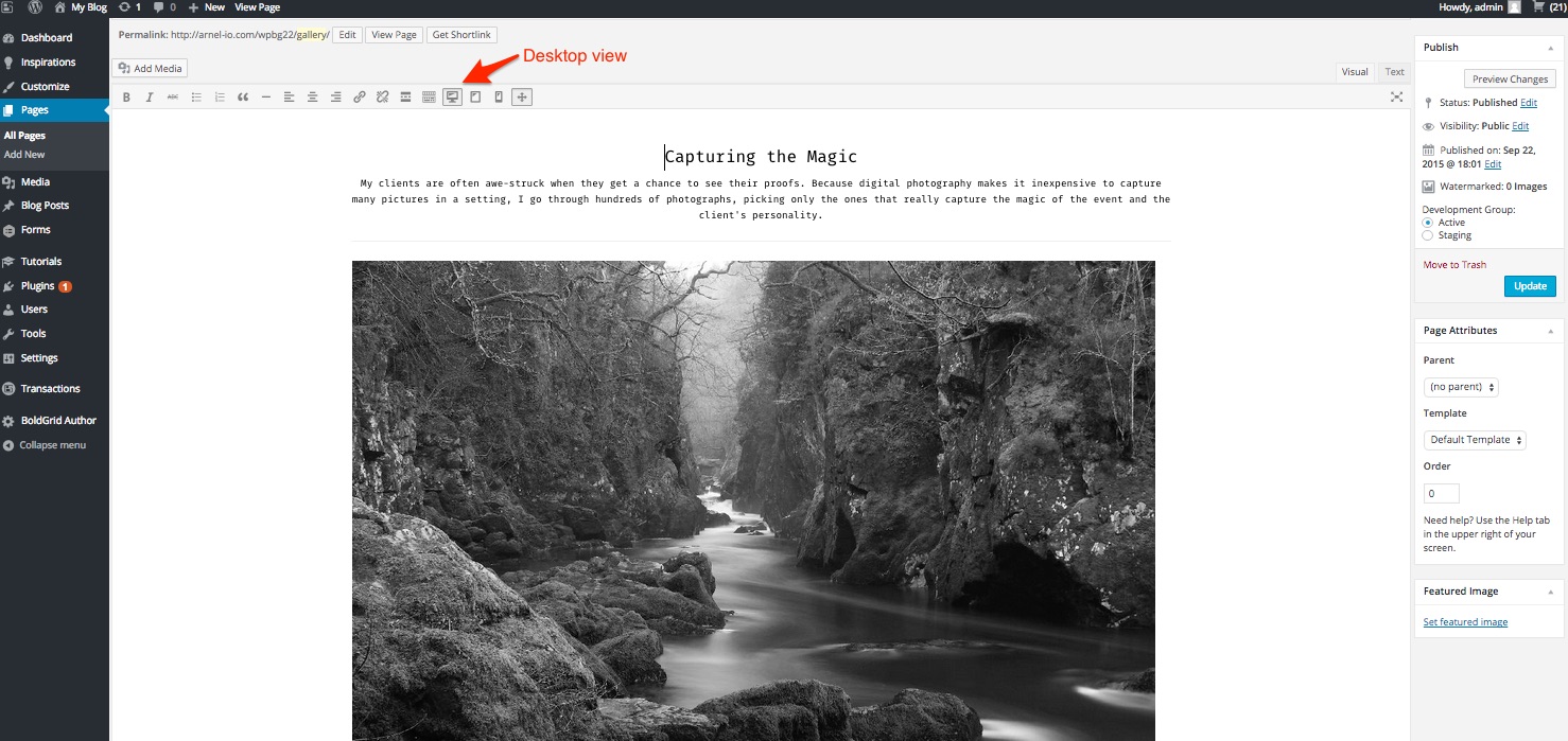
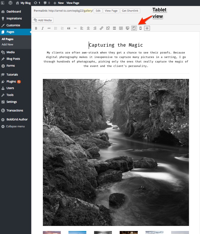
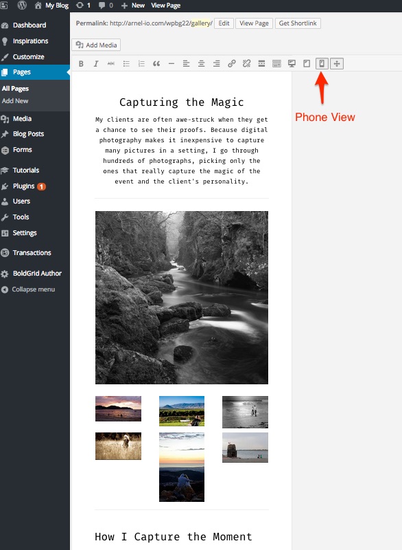
Below is an example of the different views:
Desktop View

Tablet View
Phone View
Congratulations, now you know how to use the Desktop, Tablet, and Phone Views in the BoldGrid Editor for WordPress!

Sorry to hear about the trouble you are experiencing, and the confusion this caused. Yes, the views are just for seeing how it will display across devices. Changing one will change how it displays on all devices. In 2016 when Arnel responded this may have been possible. I will remove these comments to clear it up going forward.
Thank you,
John-Paul
To clarify the comments above, the different views are for the SAME content. You can modify how the content appears in the different views, but the content remains the same. You’re basically positioning how the content appears on different size screens. Remember that the URL for the page you’re viewing is the same – you’re just viewing it on different types of screens/devices.
Arnel C.
You are correct, and Arnel should have been clearer. You cannot have separate content on the different device views.
Hello BTierney,
Thanks for the question about the 3 different views. Yes you can tailor the page for each view by making changes that only apply to each view. When you’re making changes in the editor, simply SELECT the view that you want to change. Then when the change is applied, it only applies to that specific view. I hope that answers your questions!
If you have any further questions, please let us know.
Kindest regards,
Arnel C.