Table of Contents
In this article, we will discuss the new changes within WordPress 3.8 so that you can become more familiar with the content management system that we all love. If you want to try it out, you can take a look at our article on installing WordPress manually as it is still in beta.
WordPress dashboard appearance
There are a few things that changed within the WordPress admin to make it appear better on any browser. These changes will allow for a much better user experience regardless of screen size
The WordPress dashboard is now responsive
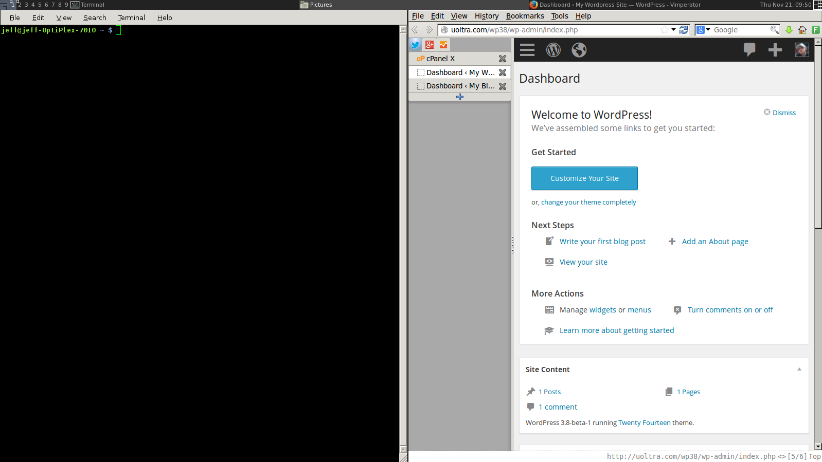
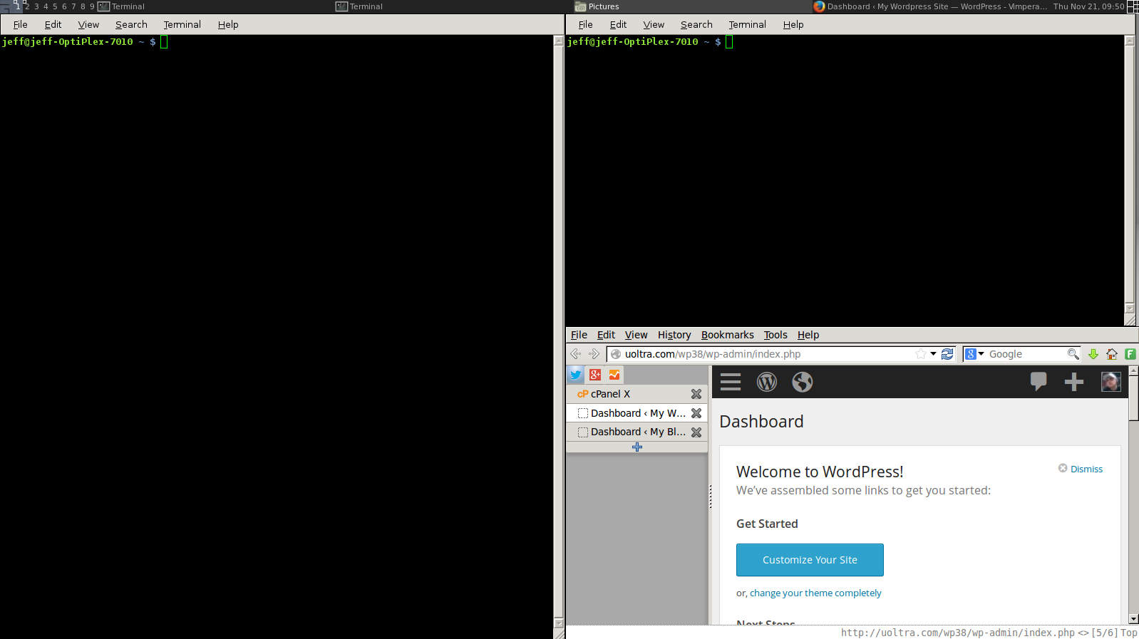
One of my favorite features if that the WordPress dashboard now implements responsive design elements. What does this mean? Employing responsive design elements means that the screen elements will change depending on your individual screen size. This allows you to have the same great experience whether you are on your computer, phone, tablet, or even on a smaller browser window off to the side. Nobody likes to scroll sideways to get to everything they want on the page and WordPress has ensure that you won’t have to.
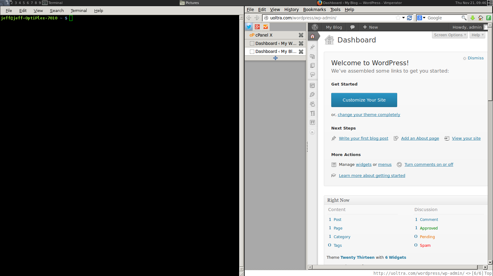
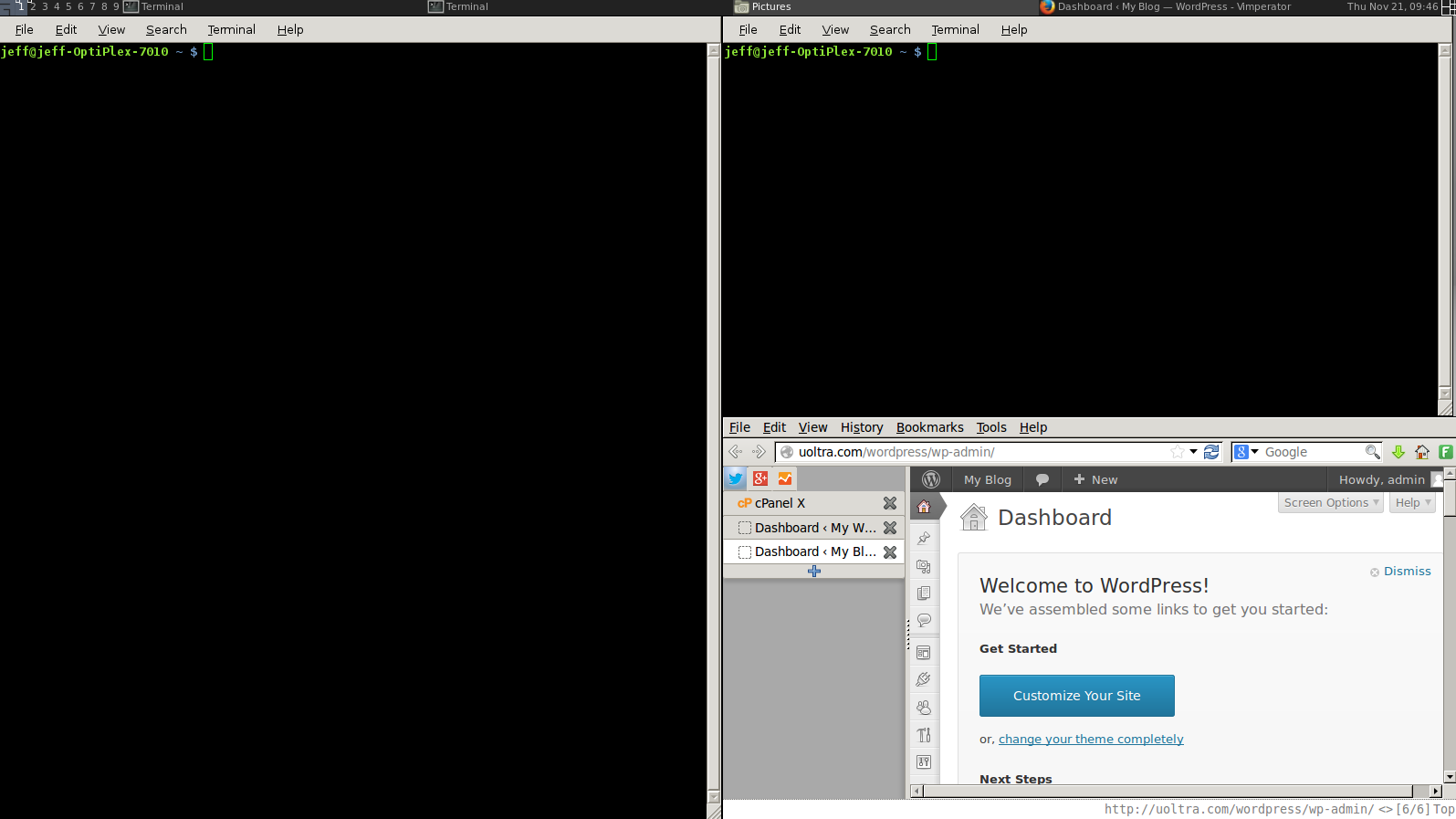
For example, I use a tiling window manager here at InMotion that resizes all of my windows when I open a new one. Previously when opening a new window on my screen that has my WordPress dashboard on it, it looked something like this when running 3.7.1:
As you can see, it is a bit hard to navigate when in a small window. Unless I know exactly where I am going and what I will be doing from memory, it can take some time to get started. With the responsive dashboard in WordPress 3.8, I can easily navigate to where I need to be and perform those actions much more efficiently when working with a smaller window:
The theme selection page has been changed
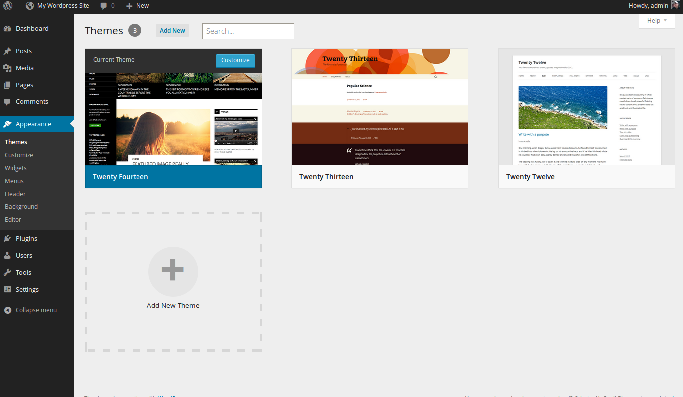
I especially like the new theme selection page. Here, you will be able to see a greater preview in a tiled format for each of the themes available to you. The theme search box has also been changed so that now you only need to enter a few letters of the search to find the theme you are looking for. This is an excellent time saver if you have a large number of themes installed.
The new default 2014 theme
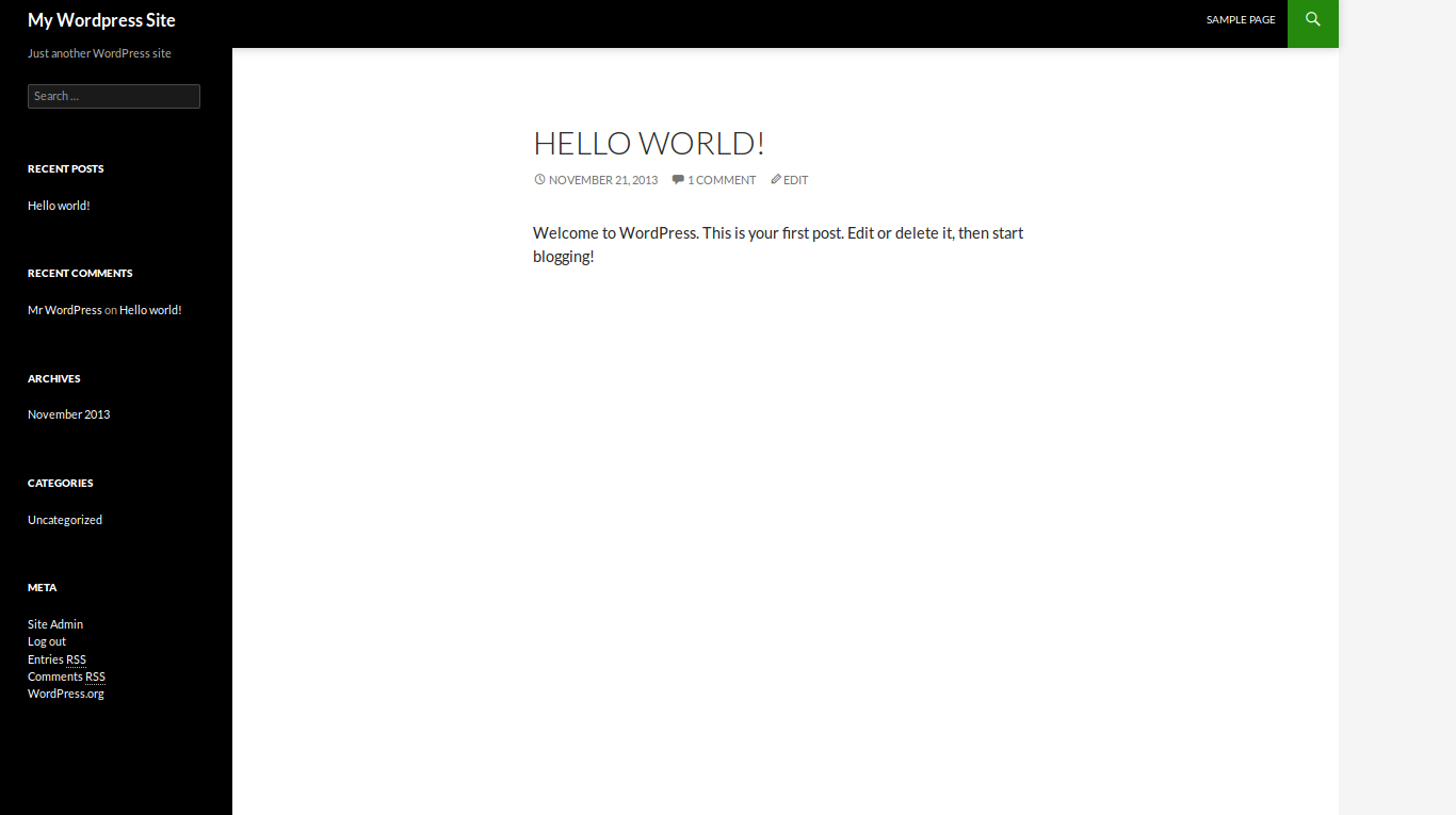
The default theme has now been updated to Twenty Fourteen which adds responsive design elements allowing your users to view your site perfectly regardless of their screen size or device. While many users do not use the default WordPress theme, it does show the true power of the WordPress theme engine. The default widget area has now been moved to the left side of the screen, and content is further displayed in a minimalistic look. The new Twenty Fourteen theme truly allows bloggers to work with the default theme right out of the box with minimal customization needed.
Conclusion
Overall, I think that this is an excellent WordPress release and it adds many features that we have been wanting for a while. While it does not add a ton of additional functionality to how your site it built, it does add further simplicity and attractiveness. Generally, I am very pleased with WordPress 3.8.
