Table of Contents
Gutenberg, the visual editor for WordPress, is a primary focus of development for Automattic, the parent company of WordPress. Mainly, they are focusing on making the process of building a website, a page, or post into a visual tour de force that doesn’t require that you write code. Stackable provides designs, custom blocks, UI kits, agency tools, integrations, and builder-like design options without sacrificing site performance.
Stackable is billed as the “ultimate companion” for Gutenberg in that it extends the visual capabilities of the editor into a complete site building tool. This guide will introduce you to the free functions of Stackable and give you the steps to installing the plugin.
- How to Install and Activate Stackable
- Free vs. Premium features
- Getting to Know Stackable
- Using Stackable in Gutenberg
How to Install Stackable
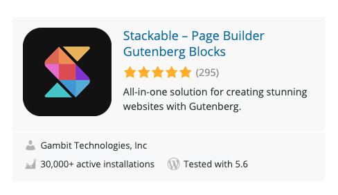
Stackable is very simple to install. You can get it by simply going to the WordPress.org Plugins page. Follow the steps below to quickly get it installed and running.
- Log in to the WordPress Administrator Dashboard.
- Click on Plugins.
- Click on Add New.
- In the search field type, “Stackable“.
- This will bring up the Stackable plugin. You will see a button labeled Install Now.
- When it finishes installing you will see the button label change to Activate. Click on this button to activate the plugin for your site.
Stackable is now ready to use when you edit or create a post or page.
Free Versus Premium
Stackable can be upgraded to the premium version through several pricing plans. There is also a lifetime plan for $499. The other plans are based on the number of sites that you want to use the plugin for. They range from $49 for a single site to $149 for an unlimited number of sites.
Premium features include 14 different options that you would not get in the free version. This also includes their one-on-one customer support and regular premium updates. You also get 353 ready-made block designs, 30 unique UI kits, and 3 layers for the separator designs. This is a list of the features that come with the free version:
- Page Builder-like Design options
- Custom Blocks (27)
- Fast Page Loading Speed
- Blog Posts Block Options (Basic)
- Ready-made Block Designs
- Unique UI Kits (7)
- Separator Designs (1 layer)
- Block Layouts (58)
- Block BG and Image Color Settings
- Block Typography Settings
- Basic Image Shapes
- Basic Icon Options
- Upload Own SVG Icons
- Basic Hover Animations
- Global Typograph
- Global Colors
- Basic Blog Settings
- WPML
- Google Fonts
- Font Awesome Free

If you’re having trouble with your WordPress host, then check out InMotion’s WordPress Hosting. We provide secure, optimized servers that are priced to meet your budget needs!
Free Domain
Free SSLs
Unlimited Bandwidth
You can find more specific information about the many features of Stackable on their website.
Getting to Know Stackable
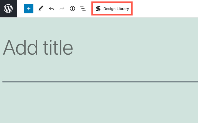
When you use Stackable in the Gutenberg editor you will be mainly interacting with the Stackable Design Library. You can access it by clicking on the Stackable icon at the top of the editor. We’ll describe each section of the library below.
Searching the Library
The library starts with a search field in the top left-hand corner. You can type in a description of what you’re searching for and the lists of UI Kits and Block Designs will change based on your query.
You can also select either UI Kits or Block Designs to see what is available in the library. The available designs will vary based on if you’re using the free or premium version.
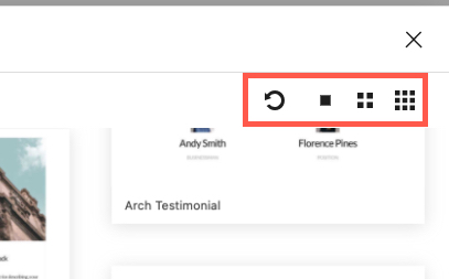
In the top right corner of the library menu, you will see options for refreshing the library and changing the size of the thumbnails of the designs that you see. This can help if you’re searching a large number of designs and you want to look at one closely without having to actually put it in a post or page.
UI Kits and Block Designs
When you select UI Kits or Block Designs you will see the categories change to show what is available to you. The thumbnails of either the UI Kits or Block Designs will also update.
In order to select a UI kit, you would go to the library thumbnails and then click on the one that you want to use. It will immediately be added to your page or post. Note that if you see a padlock over the thumbnail, then it requires that you update to the premium version to use that design.
Using Stackable
When you use Stackable, you will be in the Gutenberg editor creating or editing a post. You can use the Stackable Design Library to help accelerate and enhance the options that you have to build your post or page. Once you have selected the design, then you would need to customize or add content for your use.
UI Kits – User Interface Kits
UI kits are pre-designed blocks of interfaces that you can quickly add to your page or post to improve functionality and style. The Stackable interface gives you a LOT of control over the block. Here’s an example of one of the free headers you can add:
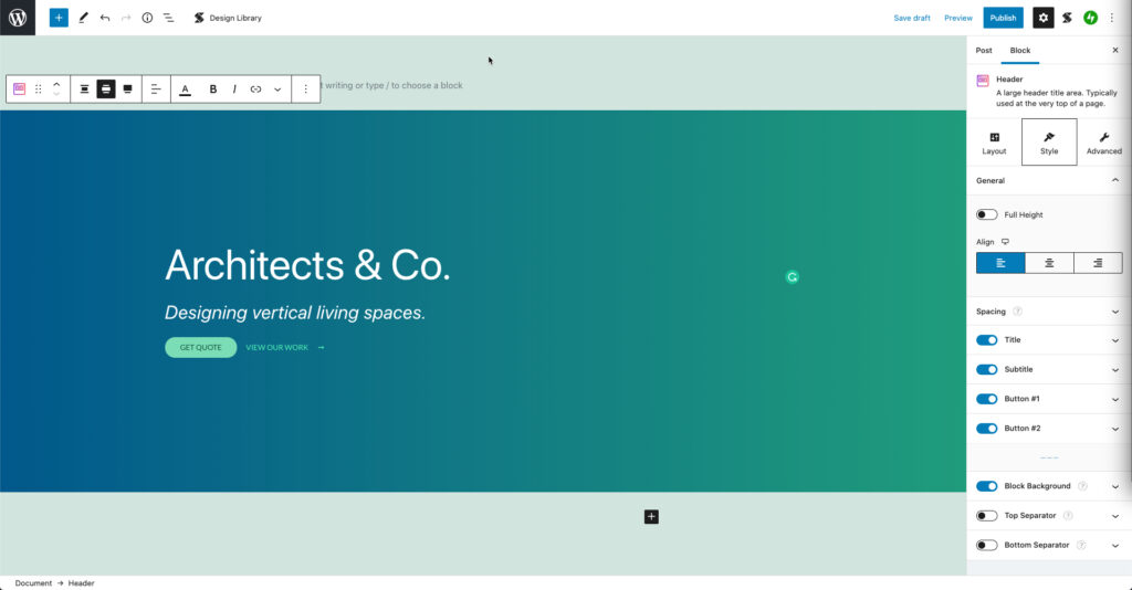
You can see that this design takes up the full width and that it has several options in the block column on the right side that you would not normally see for a default Gutenberg block. However, let’s start with the actual content in the block. There are two clickable links in this header. You can easily change the link for each by simply clicking on each link. You will see this when you click on the link:
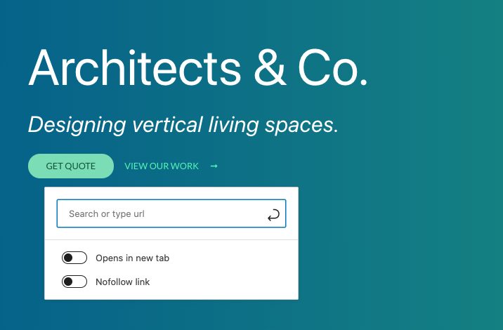
It’s quick and simple, right? Next in the block column right, click on Layout.
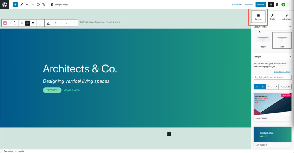
As you scroll down the right column you’ll see that it starts with a Layout option. By default, this particular design has two layouts: Basic and Plain. Plain is selected and you can see a graphical representation of the layout.
Next, you will see a section labeled Designs. This section allows you to quickly change the look and feel of the header. By default, the free version of the plugin gives you 7 free designs. There are 26 other designs that require a premium subscription.
In the center of the options for the block is the option for Style. When you click on this option you’ll see that you have control over the different aspects of the design that you selected.
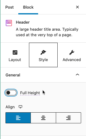
General
The General option allows for you to make the block full page height and position the content to the left, center, or right side.
Spacing
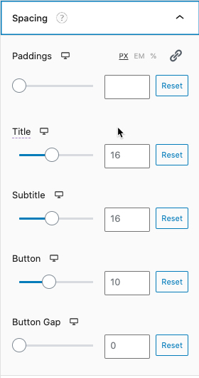
Moving down the Block column you will next see Spacing. This section gives you very particular control over how your block elements are spaced. You can set it by pixel, em, or percentage. You can then use the sliders to adjust values or type it in directly. You can also link them so they all move proportionately.
Title and Subtitle
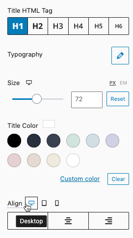
After Spacing you will see the option for Title followed by Subtitle. Each element has the same options of control. Here you can set the font, size, color and alignment. The available fonts will vary based on whether you are using the free or premium version.
Button #1 and Button #2
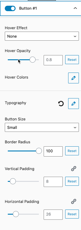
For this example, there are 2 buttons in the design. Stackable gives you many options for how you can control each button. You can see the options in the screenshots below with the descriptions of each button option following:
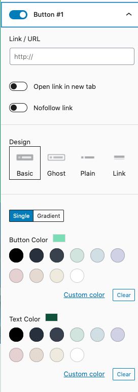
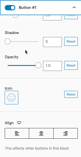
Link / URL – Here you can set the link for the button to open in a new tab and be set to nofollow.
Design – This particular design includes 4 basic designs for the button.
Single | Gradient – This section allows you to see the button color or text color. Note that you can also select custom colors or a gradient.
Hover Effect – Here you can configure the button to a particular behavior. The behaviors include: None, Lift, Scale, Lift & Scale, Scale More, and Lift & Scale More.
Typography – You can set the font family and size of the font in use in the design. You can also set the weight, transform, and letter spacing.
Button Size – Adjust the button size from Tiny, Small, Normal, Medium, and Large.
Border Radius – This affects the shape of the button. 100 makes the button round like a pill. 0 makes the button rectangular.
Vertical Padding and Horizontal Padding – This option affects the shape of the button making it either longer, shorter thinner, or thicker.
Shadow – Provides a shadow under the button. This will only be apparent depending on the background that you have selected.
Opacity – Reducing this value will make the button fade and you can remove it from being seen if the value is set to 0.
Icon – When you select this option you would click on the box and then select a graphic from the available options. This icon will appear inside the button.
Align – Lets you set left, center, and right positioning for the button.
Block Background
You can configure the background color as a solid or gradient. If it’s a gradient, you can set the starting color (color#1) and the end color (color#2) and the gradient is automatically generated. The Advanced Gradient Color Settings lets you set the gradient direction, the location of where the color changes and even the background for the gradient blend mode.
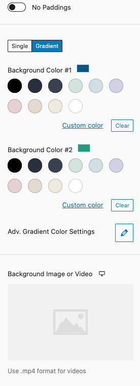
One of the more interesting options that you have for the block background is the option to add your own background or video. This option requires that your video is in the MP4 format.
Separators – Top and Bottom
The last options under style are the top and bottom separators. This option lets you select a particular style of border for the top or bottom of your design element. You can also set the color, height, and width. You also have the options for Flip Horizontally, Flip Vertically, Shadow, and Bring to Front. These options affect how the borders will appear for your design element. Bring to front allows you to move the separator so that it is in front of the design element.

Advanced
The final section of the block column for your Stackable design element is Advanced. The sections are divided into General, Block Spacing, Responsive, and Advanced (again).
General – This section allows you to have much finer control over the block HTML tag, opacity, and Z-index. The opacity and Z-index are values that can be set per device type.
Z-index – This allows you to order that elements in your design stack depending on the device that’s viewing your site.
Block Spacing – This advanced option gives you control over the minimum block height, maximum content width, content horizontal alignment, block margins, and block paddings.
Each option can be adjusted for device types (desktop, tablet, and mobile).
Responsive – You can the hide the responsiveness of the site based on a device.
Advanced – This is the default advanced section that is built in from WordPress for blocks. You can set HTML anchors or use additional CSS classes.
You can see that there are a large number of options that control the appearance and behavior of the design elements from Stackable that you can load into your website. The Stackable Plugin makes it easy to quickly build a functional and powerful website using nothing but the default WordPress editor – Gutenberg.
If you want to extend the capabilities of Gutenberg for posts or pages, or you want to expand the options that you have for building a WordPress site, then you should definitely get Stackable to add to your toolbox.
To learn more about WordPress, check out our WordPress Educational Channel.
By the way, that’s a terrifically clear and well laid out overview of Stackable!
I just bought the Stackable life time deal at AppSumo but will it have an WordPress.org installer feature? I’m a novice and running Mac OS Mojave and it looks tricky to download a WordPress site without adding other things first.
Thanks for your question, Greg. I would recommend checking with the developers or dropping that question on their support page.