“Responsive Templates” or “Responsive Web Design (RWD)” is the new wave of web design. According to Wikipedia, “Ethan Marcotte coined the term Responsive Web Design (RWD) in a May 2010“. Since then Responsive Web Design is becoming an important part of the web development process.
What is a Responsive Template?
A “Responsive Template” is a template that is designed to display a website appropriately across a large array of devices. Responsive templates are designed specifically to display your website nicely on every device platform like desktop computer, mobile phones, and tablets. This allows the website to be aesthetically pleasing on any device without having to create a separate mobile site.
What do Responsive Templates look like?
Desktop Computers
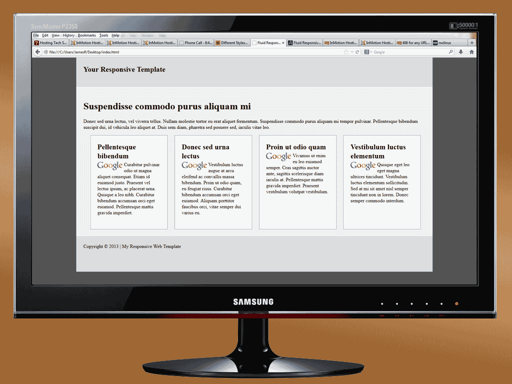
The image to the right shows how a Responsive template would display on a Desktop computer. The boxes on this example all float horizontally to take up the maximum amount of space on a larger resolution monitor.
Desktop computers are now displaying sites up to 1920 x 1080 resolution. This causes fixed width sites to look like a small strip down the middle of the screen. With a Responsive Template, the Desktop computer will stretch the site to fit according to the size of the browser.
Tablet Devices
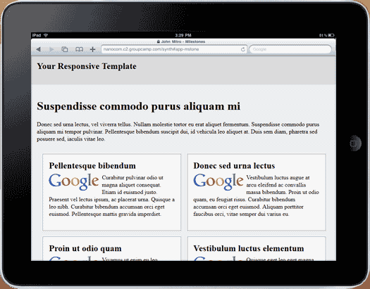
The snapshot to the right is an iPad displaying a Responsive template. This size of the site stacks the content into boxes in 2 columns. iPads screen resolution is different that the Desktop computers resolution. The iPad can have a resolution up to 2048 x1536 even though the screen size is only 9.7 inches big. This makes it necessary to detect the actual screen size of the iPad to adjust the website to the appropriate size.
Mobile Devices
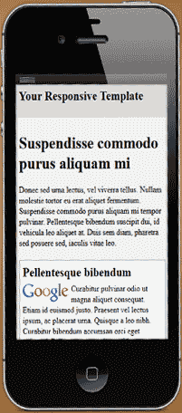
The iPhone has a 4 inch display that can handle 1136 x 640 screen resolution. A fixed screen site will not display correctly across a screen this size. In order to get the website to display you can have your site responsively switch to a vertical display of the content.
The most important design is the mobile phone layout. More and more people find your business on their phone as apposed to a desktop or a tablet because of the mobile phone access from any location. Now lets learn how Responsive templates work.
How do Responsive Templates Work?
Responsive templates use JavaScript and/or CSS (Cascading Style Sheets) to render styles differently depending on the device screen size or browser size.
Note! CSS and JavaScript are website coding languages. If you are not familiar with JavaScript and CSS you can learn about them here. Don’t worry if you do not know how to code with JavaScript or CSS. You can always get free responsive templates that are created for you.
This is done by using a fluid web layout (Uses percents as apposed to pixels), images sized in relative units (also known as “Flexible Images”), and CSS3 media queries which uses the @media rule.This alleviates the necessity to use the JavaScript browser (“user agent”) detection.
The CSS media query detects the device browser or screen size and switches the CSS stylesheet accordingly. jQuery can also be used to detect screen and browser sizes using JavaScript. This allows a site to be viewed on mobile devices, without having to create a separate site for mobile devices. CSS properties in @media rule allows different style rules for different media in the same style sheet like device-width, min-device-width, min-width, max-width and more.
Should I use a Responsive Template?
The new layouts using the @media CSS rules are supported by all new browsers; however, older browsers like Internet Explorer 7 do not support the @media rules necessary to parse the CSS. Below is a table of supported browsers.
FF | IE | Chrome | Safari | Opera | iOS Safari | Opera Mobile | Android browser |
|---|---|---|---|---|---|---|---|
3.5+ | 9+ | All | 4+ | 9.5+ | 3.2+ | 10+ | 2.1+ |
If you do not care about older browsers and you are gearing your website towards all devices then you will want to use a responsive template.
Can I make my own Responsive Template?
You can custom code your own Responsive Template. If you are not familiar with creating templates for a Content Management System (For Example creating a Responsive Template for Joomla), you may just want to download a free one that someone else made. If you want to make your own custom website based off of a responsive template, you can follow our tutorial on Creating Responsive Templates.
Where can I get a Responsive Template?
Depending on how you are developing your website will determine how you will obtain your responsive template. Below is a list of a few sources for different Content Management Systems and HTML5 that have responsive templates available.


