Table of Contents
In order for your Responsive Template to work, you will need to make at least 3 different stylesheets. The stylesheets will load depending on the size of the screen of the device. We will explain how to attach the style sheets in the next article. In the meantime we will make 3 different stylesheets, a Desktop (style.css), Tablet (medium-style.css), and a Mobile Stylesheet (mobile-style.css).
Make the general CSS style sheet
Your website will need a style sheet that holds CSS styles that do not change throughout the site. The CSS we will use is the code below. You will need to create a styles.css stylesheet to store the CSS code.
The previous code will display the colors for the background and the styles for the footer, header, and content. Next we will create the code for making the boxes change when the device screen is changed.
Creating the CSS Stylesheets for the Responsive Template
What we are going to do in the next style sheets is create a different size for the box elements. We named the boxes in the page the “box” class. The Box class is what we will change in each sheet for the images and the box size.
1. Desktop Stylesheet: min-device-width: 1440px
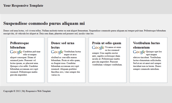
First you will need to create a file called desktop-style.css. Once you have the stylesheet created, you will need to paste the code below in the file and save it. The final result of this stylesheet will look like the snapshot to the right.
The previous code will display the Responsive site .box items horizontally. The wrapper of the site will fix the maximum width to 1600 pixels and minimum at 1240 pixels. It sets the boxes width to 18% displays the boxes inline-block and aligns them vertically top. This allows the site to display horizontally.
2. Tablet Stylesheet: min-width: 800px and max-width: 1440px
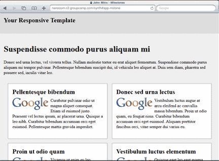
Next your will need to make a stylesheet called medium-style.css. The below code is different from the last. This code will stack the .box items in 2 columns. Paste the code in the medium-style.css sheet and save the file. The final result of this stylesheet will look like the snapshot to the right.
This will display the site with 2 columns when the browser window or the device screen is between 700 and 1439 pixels. The width for the boxes is set to 43% to make them float in columns.
3. Mobile Stylesheet: min-width: 100px and max-width: 799px
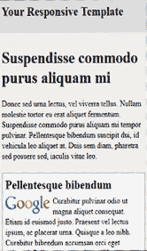
Now for the mobile stylesheet. Create a file called mobile-style.css. Paste the following code in that sheet and save the changes. The final result of this stylesheet will look like the snapshot to the right.
The previous code will display the site with the .box items stacking vertically on each other. When this stylesheet loads, you will see the boxes at 92% width. So when the screen gets below 700 pixels the boxes will float vertically. This allows a small screen to display the site better.
Now when you are finished adding the CSS code to each stylesheet, you can now link the stylesheets to your Responsive Web Template.


<a href=”https://www.yemekoyunlarim.org”>yemek oyunlar?</a> I want to make a mobile compatible system