Table of Contents
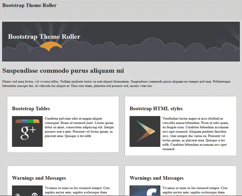
Once you have the Bootstrap Theme Roller created and downloaded. You will need to add the files to your website. The image to the right shows what the responsive template looks like before you add the Bootstrap Theme. You can compare what the theme looks like before the bootstrap is added and after in the following files. Below are the files you will need for the tutorial.
responsive-theme-start.rar
Demo Responsive Template without Bootstrap added
responsive-theme-final.rar
Demo the Responsive Template with Bootstrap added
Once you have the Responsive template files and the Bootstrap Theme Roller style, follow the steps below to add the Bootstrap files to your site.
Copy the necessary Bootstrap files
The first thing you will need to do is copy all the Bootstrap Theme Roller files to your Responsive Template. Below are the steps to do this.

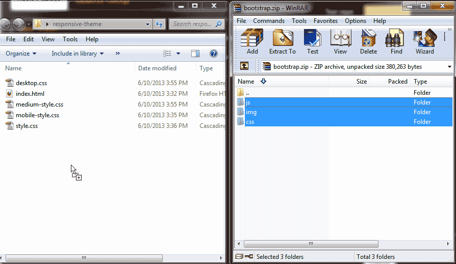
Extract the files from the Bootstrap archive on your local computer. Copy the js, img, and css folders with the files in them to your Responsive Template folder.

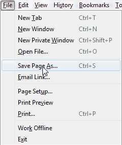
Click “Save As” in your browser to download the html from the Bootstrap Theme Roller page to your local computer.
Note! Downloading the Bootstrap Theme Roller page to your computer will save a copy of all the code you will need to add the styles to your Responsive Template. This is for your reference only and will be used through out this tutorial series to get the code you need for your Bootstrap theme.

Rename the page to ThemeRoller.htm and save the page. You will have an html page and a folder holding all the files.

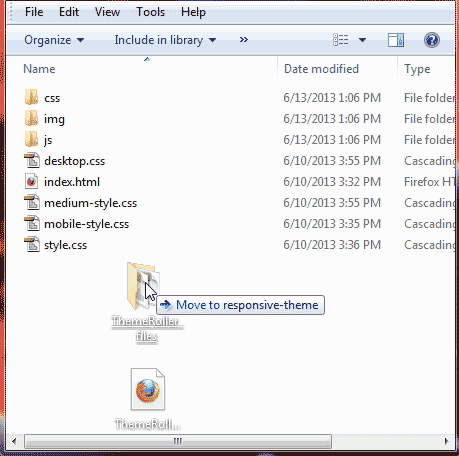
Drag the ThemeRoller.htm and the folder for it into your Responsive Template folder.

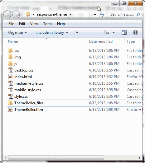
You should see the folders look like the snapshot to the right. This allows you to have a full copy of all the HTML code for the buttons, forms, dropdowns and everything you will need.
Add the JavaScript and CSS links to the head
- Open up the ThemeRoller.htm page in an HTML editor.

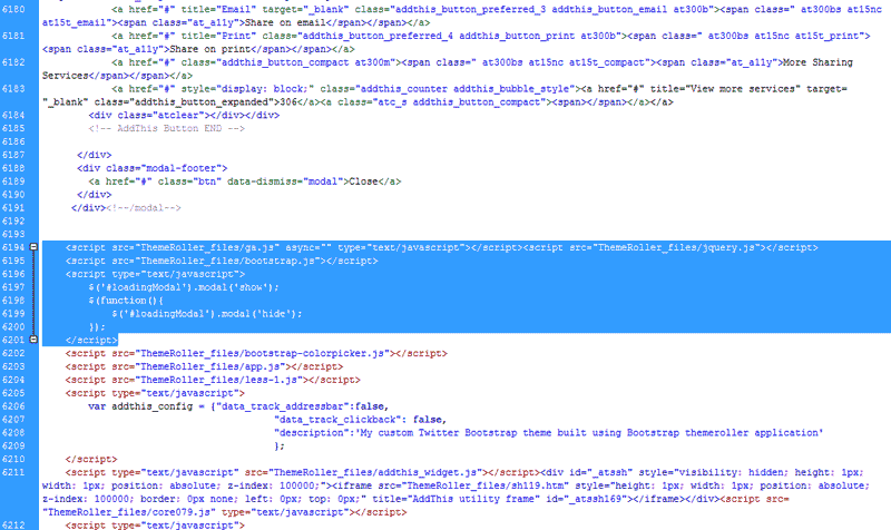
On lines 6194 to 6201 the code you need for your Responsive template can be found. The line numbers may vary. The important code is the like following.
Important! The ga.js and the jquery.js are required for the drop menus and other behaviors to work. If your menus do not work, you may not have these files.

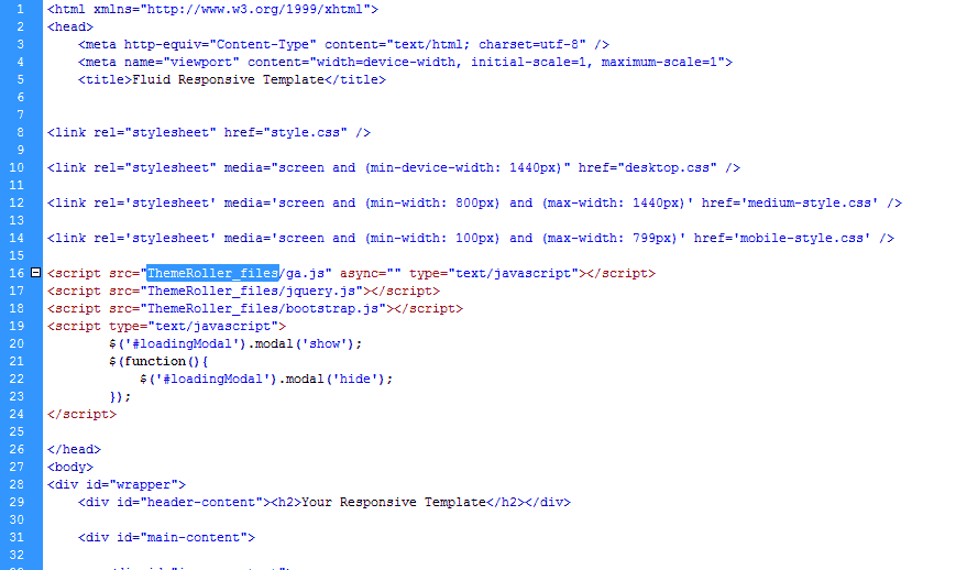
Open the index.html page of your responsive template. Paste the script code in the head section of your template. You can place the code after the stylesheet links.

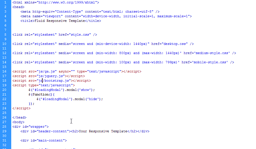
Rename the links in the scripts to your folder location. In this case, the js folder holds the JavaScripts so we will rename the ThemeRoller part of the link to js. The final code is below.

Add the link to your stylesheet in the head section. This will link your Bootstrap styles to your Responsive template. The code is below.
Copy ga.js and jquery.js
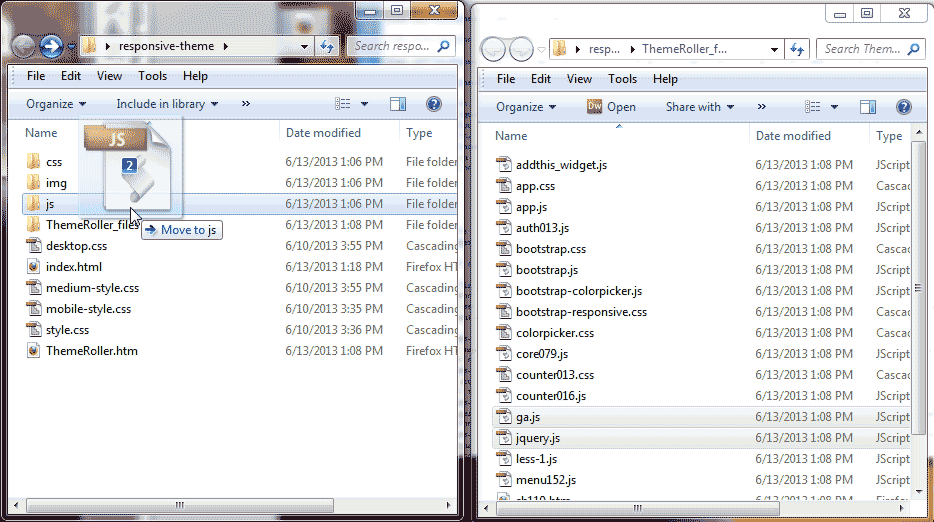
Now that you have the links in your head section, you will need to copy the ga.js and the jquery.js to your js folder in your Responsive Template. Copy the ga.js and the jquery.js files to your js folder.
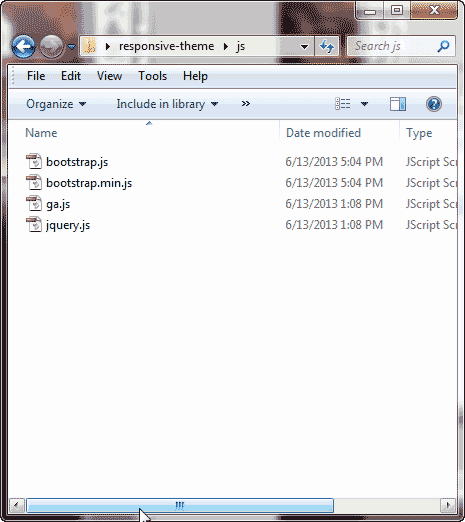
When all done you should have the following JavaScript files in your js folder. See image to the right.
Now you have all the files necessary to develop your Bootstrap Responsive template. The next step is to add th SS classes and the HTML code to your site to make the styles come alive.


very helpful post for Responsive Web Designers, they will easily understand how to configure and add links in header section !! Thanks…