Adding the Bootstrap Menu Buttons to your Responsive Template

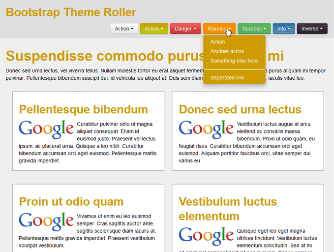
View os Menu Buttons in Bootstrap Theme Roller

Now that you have Bootstrap set up on your Responsive Template, you can use the code provided by Bootstrap to style your site. Bootstrap has a premade set of buttons and menus that you can use in your site. You can see what the look like in the snapshot to the right.In this tutorial, we will add all the buttons to the header of your site. Below are examples of the button function with the InMotion hosting Bootstrap styles.

Steps to add a Bootstrap Button menu

Below is the code for each button type. When stringing multiple buttons together you will need to use the toolbar code below.

<div class="btn-toolbar">      --- Button code goes here inbetween the toolbar divs. --- </div>

Now you can use the following buttons on your site.

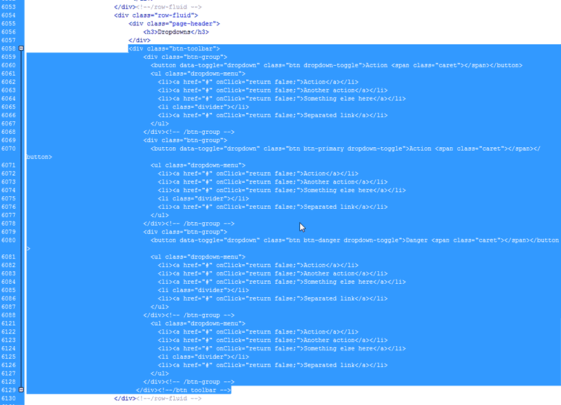
  1. Copy the code Bootstrap Theme Roller

    Open up the ThemeRoller.htm page and find the button code between lines 6058 to 6129. The Line numbers may vary.

    Copy the code.

    The code is broken down below.

    The Default ButtonThe Default Button

    <div class="btn-group">
    <button data-toggle="dropdown" class="btn dropdown-toggle">Action <span class="caret"></span></button>
    <ul class="dropdown-menu">
    <li><a href="#" onClick="return false;">Action</a></li>
    <li><a href="#" onClick="return false;">Another action</a></li>
    <li><a href="#" onClick="return false;">Something else here</a></li>
    <li class="divider"></li>
    <li><a href="#" onClick="return false;">Separated link</a></li>
    </ul>
    </div><!-- /btn-group -->


    The Primary ButtonThe Primary Button

    <div class="btn-group">
    <button data-toggle="dropdown" class="btn btn-primary dropdown-toggle">Action <span class="caret"></span></button>
    <ul class="dropdown-menu">
    <li><a href="#" onClick="return false;">Action</a></li>
    <li><a href="#" onClick="return false;">Another action</a></li>
    <li><a href="#" onClick="return false;">Something else here</a></li>
    <li class="divider"></li>
    <li><a href="#" onClick="return false;">Separated link</a></li>
    </ul>
    </div><!-- /btn-group -->


    The Danger ButtonThe Danger Button

    <div class="btn-group">
    <button data-toggle="dropdown" class="btn btn-danger dropdown-toggle">Danger <span class="caret"></span></button>
    <ul class="dropdown-menu">
    <li><a href="#" onClick="return false;">Action</a></li>
    <li><a href="#" onClick="return false;">Another action</a></li>
    <li><a href="#" onClick="return false;">Something else here</a></li>
    <li class="divider"></li>
    <li><a href="#" onClick="return false;">Separated link</a></li>
    </ul>
    </div><!-- /btn-group -->


    The Warning ButtonThe Warning Button

    <div class="btn-group">
    <button data-toggle="dropdown" class="btn btn-warning dropdown-toggle">Warning <span class="caret"></span></button>
    <ul class="dropdown-menu">
    <li><a href="#" onClick="return false;">Action</a></li>
    <li><a href="#" onClick="return false;">Another action</a></li>
    <li><a href="#" onClick="return false;">Something else here</a></li>
    <li class="divider"></li>
    <li><a href="#" onClick="return false;">Separated link</a></li>
    </ul>
    </div><!-- /btn-group -->


    The Success ButtonThe Success Button

    <div class="btn-group">
    <button data-toggle="dropdown" class="btn btn-success dropdown-toggle">Success <span class="caret"></span></button>
    <ul class="dropdown-menu">
    <li><a href="#" onClick="return false;">Action</a></li>
    <li><a href="#" onClick="return false;">Another action</a></li>
    <li><a href="#" onClick="return false;">Something else here</a></li>
    <li class="divider"></li>
    <li><a href="#" onClick="return false;">Separated link</a></li>
    </ul>
    </div><!-- /btn-group -->


    The Info ButtonThe Info Button

    <div class="btn-group">
    <button data-toggle="dropdown" class="btn btn-info dropdown-toggle">Info <span class="caret"></span></button>
    <ul class="dropdown-menu">
    <li><a href="#" onClick="return false;">Action</a></li>
    <li><a href="#" onClick="return false;">Another action</a></li>
    <li><a href="#" onClick="return false;">Something else here</a></li>
    <li class="divider"></li>
    <li><a href="#" onClick="return false;">Separated link</a></li>
    </ul>
    </div><!-- /btn-group -->


    The Inverse ButtonThe Inverse Button

    <div class="btn-group">
    <button data-toggle="dropdown" class="btn btn-inverse dropdown-toggle">Inverse <span class="caret"></span></button>
    <ul class="dropdown-menu">
    <li><a href="#" onClick="return false;">Action</a></li>
    <li><a href="#" onClick="return false;">Another action</a></li>
    <li><a href="#" onClick="return false;">Something else here</a></li>
    <li class="divider"></li>
    <li><a href="#" onClick="return false;">Separated link</a></li>
    </ul>
    </div><!-- /btn-group -->


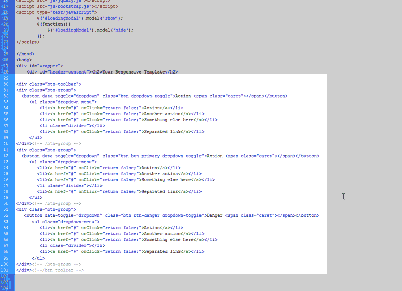
  2. Paste the code in the header Bootstrap Theme Roller

    Paste the code into the head section after the header-content H2 tag. It should look like the snapshot to the right.

    The buttons are different colors If you want a button to use a specific color you can change the buttons class. below are the different button classes for the button menus in Bootstrap.

    Class nameDescription
    btn-inverseDefault colors #555 and #222
    btn-infoDefault colors #5bc0de and #2f96b4
    btn-successDefault colors ##62c462 and #51a351
    btn-warningDefault colors #fcb44d and #f89406
    btn-primaryDefault colors #c3b100 and #b5cc00
    btn-dangerDefault colors #ee5f5b and #bd362f


Was this article helpful? Join the conversation!