Table of Contents
You created or a web designer created your website but you haven’t touched your website since it was launched years ago. Web trends have changed and your website is starting to look more like an archive from the past than the modern business you would like it to represent. If you don’t have the budget, time or expertise to completely overhaul your website, you can make small, impactful changes to your website to give it a fresh look. Modernizing your old website will breathe new life into your work. Follow the guide below to learn how.
In This Article:
- Adding/Updating Hero Images
- Refreshing Content
- Change Background Colors
- Remove Sidebar
- Add Modern Elements
Experience secure, WordPress optimized hosting with our WordPress Hosting plan.
Adding/Updating Hero Images

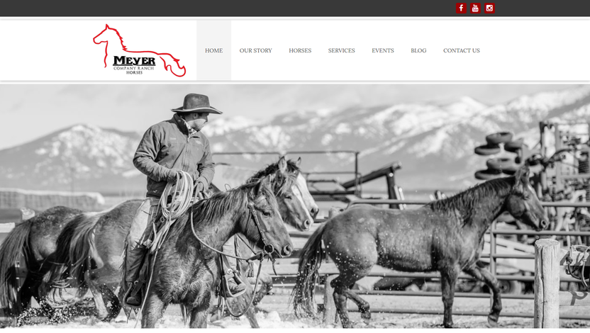
A hero image is a large image that lives at the top of your website and serves as a powerful design element that can quickly convey the purpose of your website. The hero image welcomes end users to your website, gives them a visual explanation of what to expect, and can also help direct the action you want them to take on your site. A great hero image is relevant to your business and high-quality. They help establish professionalism and authority with the end-user. Hero images are great on the homepage in both static and rotating form.
The architecture of your website will dictate how you add this element to your pages. If you have a WordPress site, you should be able to easily add a hero image with the assistance of plugins. If you’re using a WordPress theme, it should be even easier as the theme should give you the ability to add a large image to your homepage. HTML sites should be able to add an image as well; however, consider a responsive redesign for easier updates in the future.
Refreshing Content
Is the content on your website still relevant? Is it as concise as it can be? Is it being presented in a way that is easy to digest? Refreshing your content not only allows you to review and tailor what is being read by the public but it also keeps your website relevant to Google. Updated content shows Google and end-users that your website is still a valid source for the information they seek.
In addition, be aware of how the content is presented on the website. Content that is long and dense will cause a high bounce rate. End users will not stick around to read a lot of text. Layout content so it’s easy to scan and read quickly. Add a good amount of white space between paragraphs and thoughts, and make sure your sentences are short. Good, concise content that is updated regularly will help you maintain and grow your website traffic.
Change Background Colors
Changing background colors on your site is similar to adding a new coat of paint to your house; it’s an easy way to quickly update the look and feel without a lot of fuss. If you have a darker site, think about using white or lighter colors for a drastic renovated effect. If your website is already white, try adding a light color or accent color to add visual interest. Again, depending on how your website was built, you may have to jump into the code to change the color, but it still should be much simpler than completely overhauling your website.
Remove Sidebar
Consider removing the sidebar, at least from the homepage. Sidebars, though they have some practical use (especially on eCommerce sites), are an older web trend and can date your website. It can also be an added distraction when end users visit your website, adding noise to their experience and possibly preventing them from completing the action you ultimately want them to take — like submitting a form or scheduling an appointment. Having a clean homepage will allow end-users to receive your message easily and focus on the action you want them to complete, instead of getting lost in the sidebar content.
Add Modern Elements
To quickly add modern, interesting elements to your website, try adding plugins that elevate your content, like a slider, testimonial, events or form plugin. If your business receives a lot of testimonials, showcase them with a sleek testimonials plugin that rotates the reviews or lays them out in a modern way. If you have a picture heavy business like an eCommerce or photography business, try adding an image rotator or slider to your website to present the images in an interesting way. Using plugins to update how you showcase certain content on your website is an easy way to quickly update the look of your website
However, be careful not to add too many plugins to your website. Too many plugins can slow your website down, which will affect your bounce rate. So only add the plugins you absolutely need.
Modernizing your website does not need to be a hard task and can be easily done by following the suggestions above. By adding certain plugins, updating your content and changing background colors, you can give your website a new look without having to overhaul the entire site.
If you want to update your website but do not know where to start, consider our White Glove services with our experienced web design team. With White Glove, our web design team can make small changes to your existing WordPress site to update the look and feel!

Nice blog, it is also a best way for promoting old website. Thanks for giving more information.